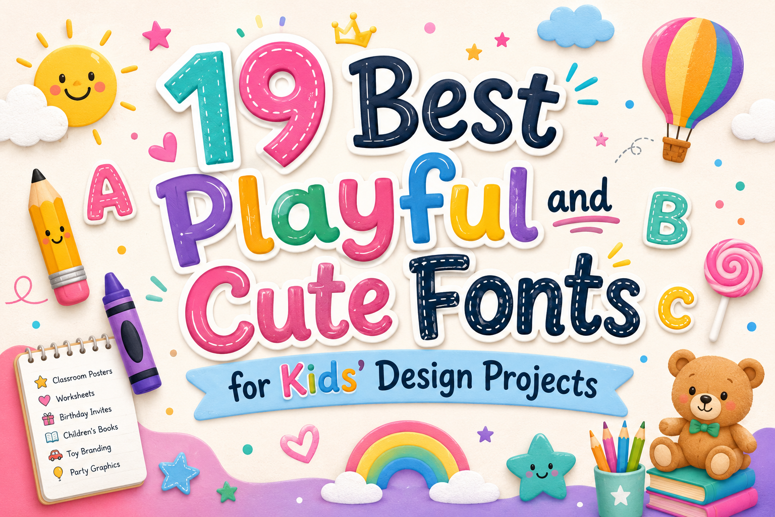
Choosing the right font for children’s design is not only about finding something cute. A good kids’ font should feel friendly, fun, and age-appropriate, but it also needs to be readable enough for the project. A font that works beautifully for a birthday invitation title may not be the best choice for a worksheet, classroom poster, or children’s book subtitle.
This collection of playful and cute fonts for kids includes soft handwritten styles, cheerful display fonts, comic-inspired lettering, school-style fonts, candy-themed typefaces, and bold game-like options. Some are better for classroom materials and learning pages, while others are more suitable for party graphics, toy branding, packaging, children’s book covers, and energetic social media visuals.
Before choosing a font, always preview it with your own text. Check uppercase, lowercase, numbers, punctuation, and small-size readability, especially if your design is meant for parents, teachers, or young readers.
What Makes a Font Suitable for Kids’ Design Projects?
Kids’ design usually needs a balance between personality and clarity. Rounded shapes, uneven handmade lines, friendly letterforms, and playful spacing can make a design feel more approachable. However, too much decoration can quickly reduce readability.
Cute fonts often feel soft, sweet, and gentle. They work well for nursery graphics, birthday invitations, preschool materials, and friendly product packaging. Playful fonts are usually more energetic and flexible, making them useful for posters, children’s branding, activity sheets, and fun headlines. Comic-style fonts feel expressive and adventurous, while bold display fonts are stronger choices for game-inspired visuals, cartoon titles, and high-impact posters.
Decorative fonts should usually be used for titles, short headings, labels, and accent text. For long paragraphs, instructions, or reading materials, pair them with a simpler font so the design stays easy to understand.
Best Playful and Cute Fonts for Kids’ Design Projects
1. Ronaldi Guje
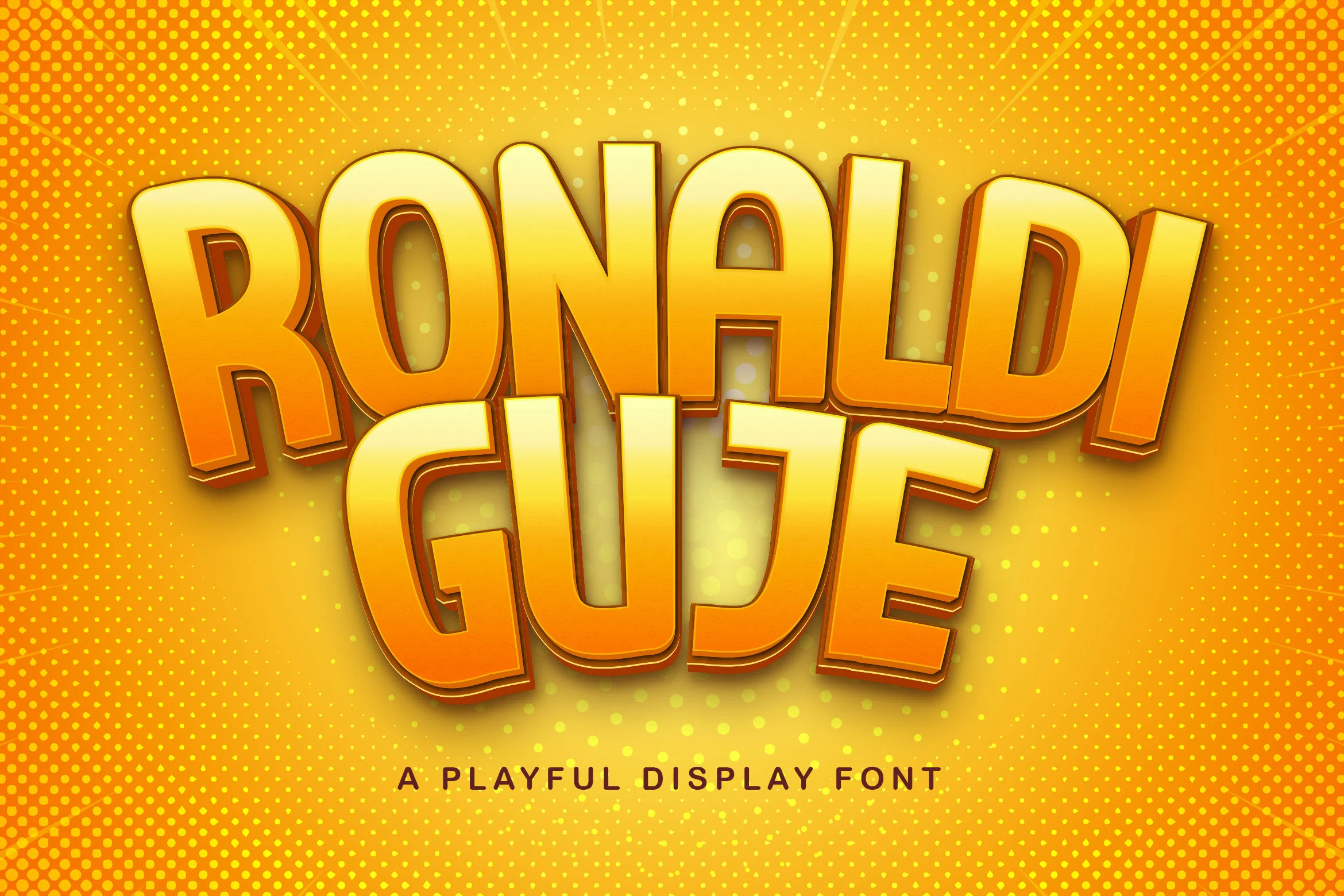
Ronaldi Guje is a bold display font with a strong, high-impact look. It has a playful 3D-style personality, but it leans more toward gaming, cartoons, and energetic posters than soft nursery design.
Use it for large headlines, game-inspired kids’ graphics, cartoon event posters, or bold title artwork. Because of its heavy visual style, it is not ideal for long paragraphs or small supporting text. The license is listed as free for personal use, so check the author terms before using it commercially.
2. Hiroshima
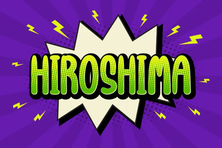
Hiroshima has an urban, graffiti-like mood that feels active and expressive. It is playful, but not the best match for gentle cute projects. Instead, it works better for comic-style layouts, action themes, YouTube thumbnails, and energetic social media graphics.
This font is good for short titles and display use. Keep the text brief, and avoid using it for educational body copy or detailed instructions. Its license is listed as free for personal use.
3. Single Day
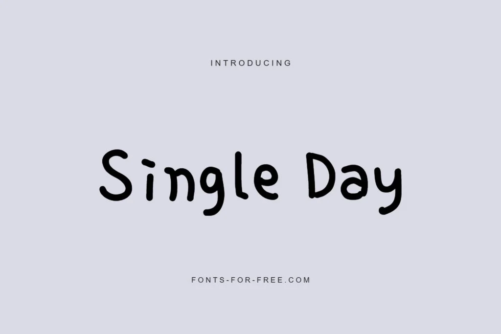
Single Day is one of the most practical choices in this list for classroom and casual children’s projects. Its handwritten style feels natural, simple, and personal without becoming too decorative.
It works well for worksheets, activity pages, classroom labels, casual posters, and friendly kids’ designs. The readability is stronger than many decorative fonts here, so it can handle medium-length text better. The license is listed as Public domain / OFL, but it is still a good habit to review the font page before publishing or distributing a project.
4. Lionel Virgi
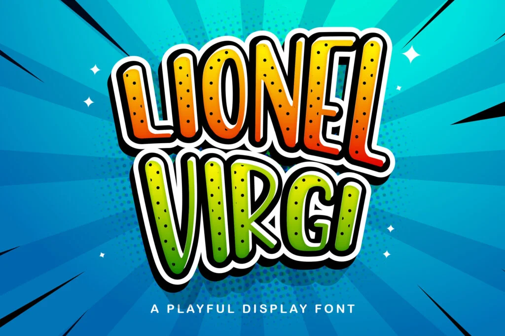
Lionel Virgi is a decorative display font with a comic-style personality. It feels expressive and lively, making it suitable for bold kids’ posters, cartoon titles, game-themed graphics, and playful headline designs.
This is not a quiet or minimal font. Use it when the design needs energy and personality. It reads best in short titles rather than long text blocks. The license is listed as free for personal use.
5. Alexander Display
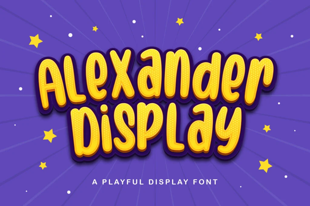
Alexander Display has a cheerful rounded look that fits the cute and playful side of children’s design. It feels friendly enough for birthday graphics, classroom titles, posters, and fun branding.
The font is best used for short display text, especially when you want a warm and approachable headline. It is readable at larger sizes, but for longer descriptions or instructions, pair it with a simpler supporting font. Its license is listed as free for personal use.
6. Tulis Yuk
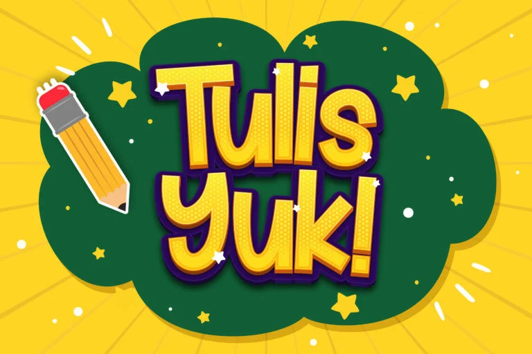
Tulis Yuk has a school-style display look that fits education-themed projects well. It feels playful, friendly, and suitable for designs connected to learning, classrooms, and kids’ activities.
Use it for learning posters, worksheet titles, classroom graphics, educational flashcards, and children’s activity headers. It is good for short titles and display use, but not the best choice for long reading passages. The license is listed as free for personal use.
7. Pisang Keju
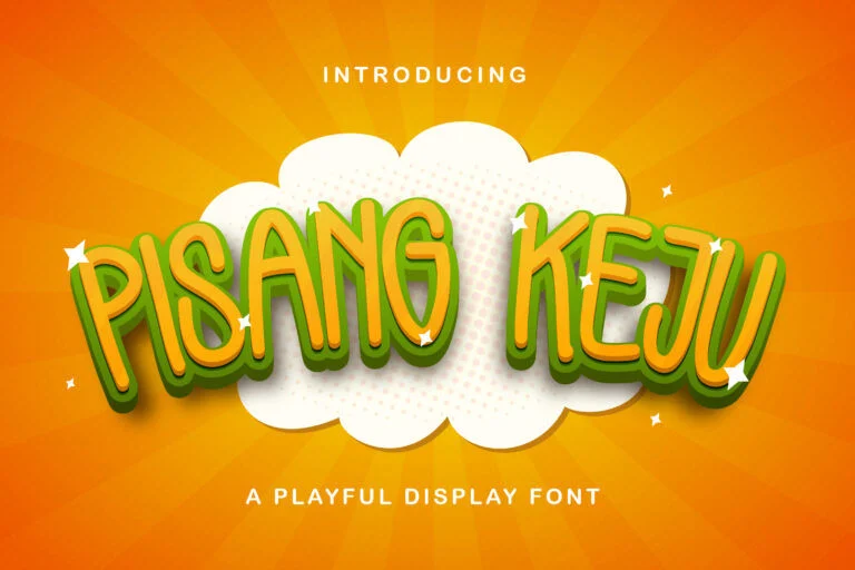
Pisang Keju is quirky, fun, and expressive. It has a playful food-friendly character, which makes it a strong option for snack packaging, cheerful product labels, food-themed kids’ designs, and bright poster titles.
This font works best when the design needs a playful and slightly unusual personality. Keep it for short headings, packaging names, and decorative text. The license is listed as free for personal use, so commercial packaging use would require extra license checking.
8. Heinzo
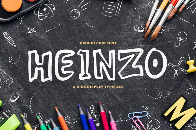
Heinzo has a doodle-like, chalkboard-inspired feeling. That makes it useful for school posters, classroom boards, learning materials, creative kids’ projects, and handmade-style educational graphics.
Its casual personality helps the design feel less formal, but it is still better as a title or short display font. Use it for headings, labels, and decorative classroom text rather than long paragraphs. The license is listed as free for personal use.
9. Super Kids Playful Display Font
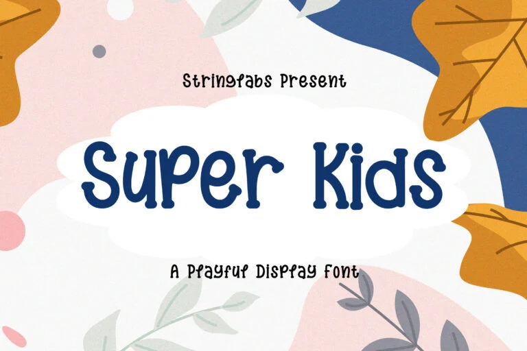
Super Kids Playful Display Font is one of the strongest matches for playful children’s design. It feels clearly kid-friendly, cheerful, and readable enough for titles, posters, invitations, and children’s product graphics.
This font is a good choice when you want something playful without making the text too difficult to read. Use it for birthday posters, toy packaging, classroom headers, and fun children’s branding. It is listed as free for personal use.
10. Jangkids Playful Display Font
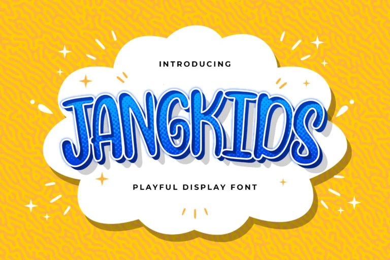
Jangkids Playful Display Font has a bold outlined look that gives it a strong title-focused character. It works well for posters, classroom headers, playful branding, and children’s event graphics.
Its uppercase readability is strong, so it can be useful when you need a clear headline with personality. However, because it is decorative, it should still be used mainly for display text. The license is listed as free for personal use.
11. Kinder Boys Playful Font
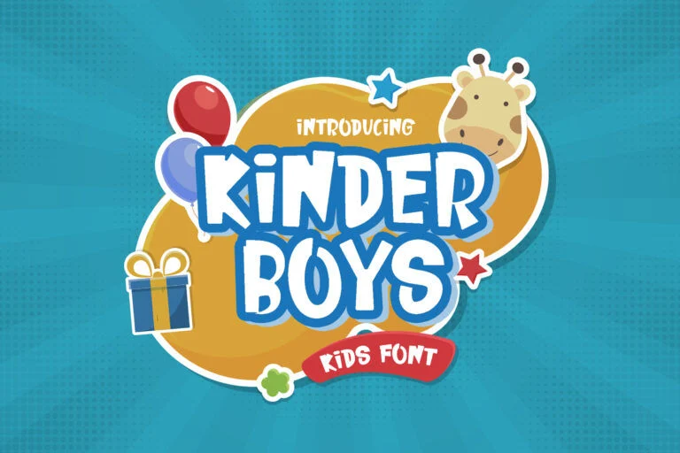
Kinder Boys Playful Font is friendly, bold, and cheerful. It has the kind of strong kids’ design personality that works well for toy branding, birthday posters, nursery graphics, and fun children’s layouts.
This font is especially useful when you need uppercase text that feels playful but still clear. Use it for short headlines, product names, and bold design elements. The license is listed as free for personal use.
12. Weatpoint Playful Script Font
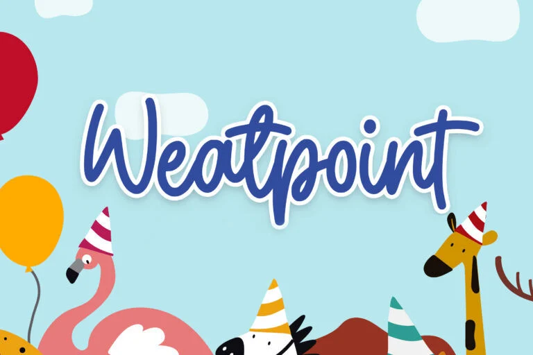
Weatpoint Playful Script Font brings a cute handwritten script style to the collection. It works nicely for birthday invitations, party graphics, decorative quotes, cheerful titles, and sweet children’s designs.
Because it is a script font, avoid using it for long text or small instructions. Thin or connected letterforms can become harder to read at smaller sizes, especially for young readers. Its license is listed as free for personal use.
13. Playkidos Playful Font
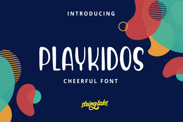
Playkidos Playful Font is clean, simple, and approachable. It feels cheerful without being overly decorative, which makes it useful for classroom posters, activity sheets, children’s book subtitles, and simple kids’ layouts.
This is one of the better options when readability matters more than heavy decoration. It can work for medium-length text, but you should still test it at the exact size you plan to use. The license is listed as free for personal use.
14. Helloo Kidos Playful Display Font
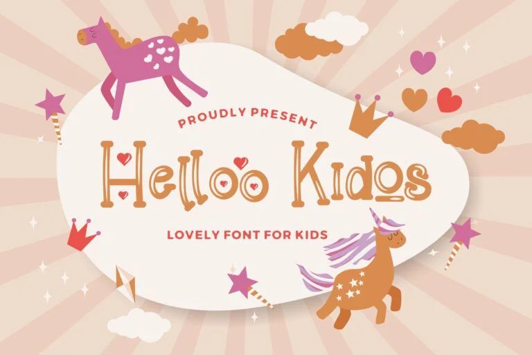
Helloo Kidos Playful Display Font has a decorative, fairytale-like mood. It fits cute invitations, nursery designs, unicorn-themed graphics, magical children’s titles, and soft display layouts.
This font has a strong decorative style, so use it sparingly. It is best for a title, name, or short phrase rather than body text. The license is listed as free for personal use.
15. Hirokuda Playful Display Font
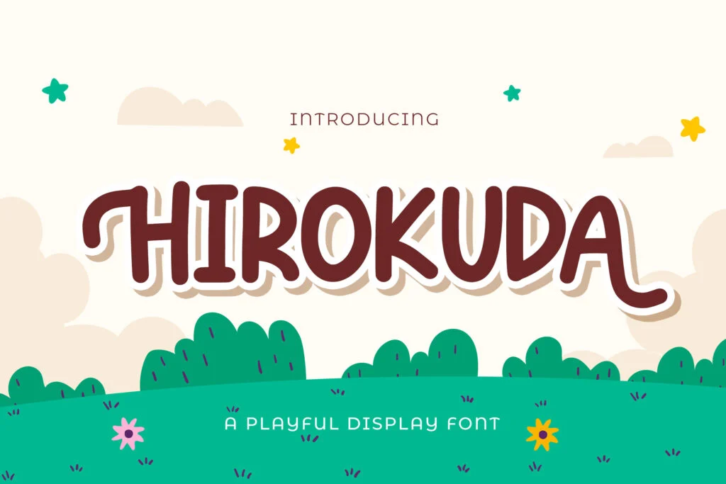
Hirokuda Playful Display Font has a rounded playful look that feels friendly and easygoing. It is suitable for cheerful posters, children’s book titles, packaging, and fun kid-friendly graphics.
It works best for short titles and display text. The mood is more broadly playful than delicate, so it can fit both classroom and product-style designs. The license is listed as free for personal use.
16. Pakuintho Playful Display Font
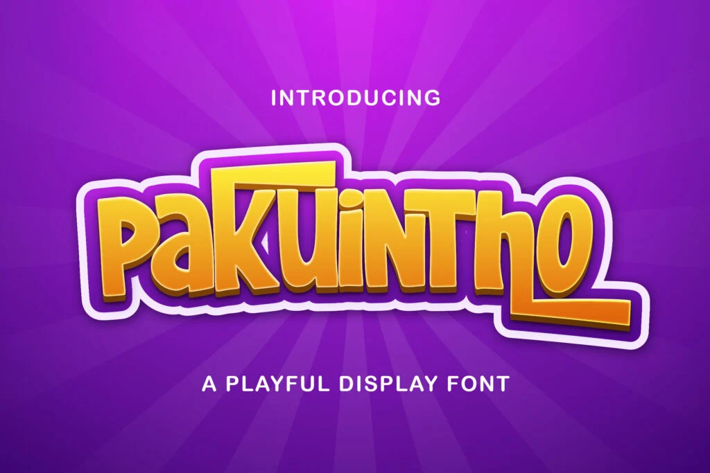
Pakuintho Playful Display Font is more game-like than cute. It has a bold, strong, high-impact style that fits kids’ gaming banners, cartoon-style headlines, energetic titles, and action-themed graphics.
This font is not the right choice for soft nursery posters or gentle preschool designs. Use it when the project needs power, movement, and excitement. It is best for large headlines, not paragraphs. The license is listed as free for personal use.
17. Hey Kidos Playful Display Font
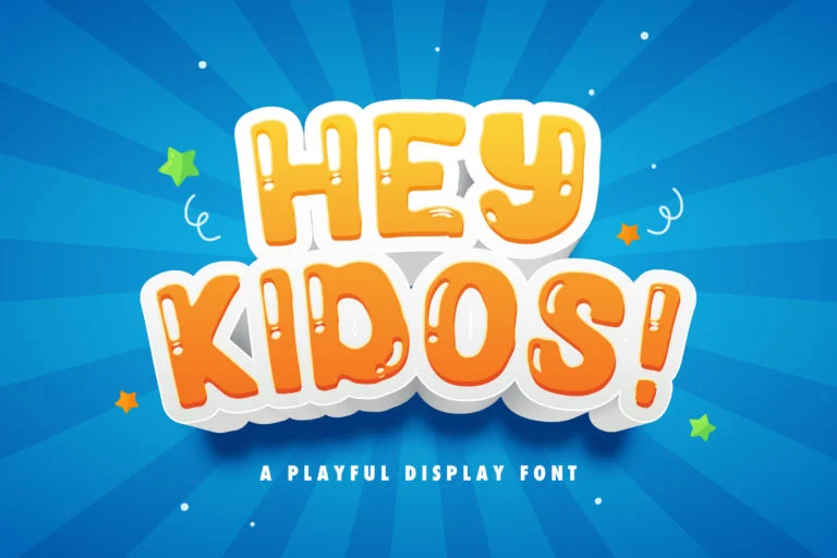
Hey Kidos Playful Display Font is one of the best fits for cheerful kids’ design. Its rounded, bubbly, friendly look makes it suitable for posters, party designs, children’s branding, and playful headlines.
The font has enough personality to feel fun without becoming too hard to read in short text. Use it for titles, invitations, product graphics, and social media visuals. Its license is listed as free for personal use.
18. Comic Boys – Kids Bubble Font
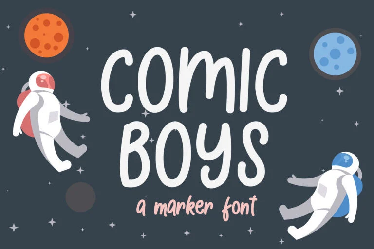
Comic Boys – Kids Bubble Font has a casual marker-style look with an adventurous kids’ mood. It is a good fit for space themes, comic-style children’s designs, posters, and educational graphics.
Because it has a handwritten feel, it can make layouts feel personal and energetic. It is readable for medium-length text, but still works best when the text is not too dense. The license is listed as free for personal use.
19. Candy Putri
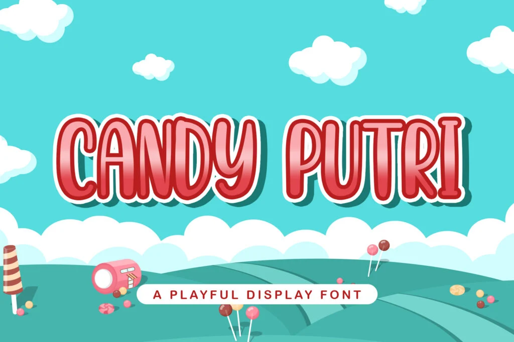
Candy Putri is a cute display font with a sweet, candy-inspired personality. It is a strong choice for birthday invitations, party graphics, candy packaging, toy branding, and cheerful title designs.
Use it when the project needs a soft, fun, and sweet visual tone. Like most decorative kids’ fonts, it is better for short display text than long paragraphs. The license is listed as free for personal use.
How to Choose the Right Kids Font
Start with the mood of the project. For classroom worksheets and activity pages, choose cleaner handwritten fonts like Single Day or Playkidos because readability matters. For birthday invitations, party graphics, and sweet designs, fonts like Candy Putri, Weatpoint, Alexander Display, and Helloo Kidos can create a warmer cute feeling.
For posters, toy branding, packaging, and bold children’s titles, stronger display fonts such as Super Kids, Hey Kidos, Kinder Boys, Jangkids, and Hirokuda are more effective. For comic, action, or gaming-inspired visuals, Ronaldi Guje, Hiroshima, Lionel Virgi, and Pakuintho are better choices.
Avoid using too many playful fonts in one design. One decorative font for the headline and one simple font for supporting text is usually enough. Also, test the font with real words before downloading. A font may look fun in a sample, but the actual project title may include letters, numbers, or punctuation that change the result.
For more options, you can explore the display font category and compare different headline styles. If you want to test fonts more carefully before choosing, read this guide on how to preview fonts before downloading. After downloading, this guide on how to install fonts on your computer can help you start using them in your design software.
Font License Reminder
Many fonts in this list are marked as free for personal use. That does not automatically mean they are free for commercial projects. If you are designing products for sale, branding for a business, packaging, paid invitations, merchandise, or client work, check the font page and the author’s license terms before using the font.
This is especially important for small business owners and designers creating commercial designs for children’s brands, schools, events, or products. A quick license check can prevent problems later.
FAQ
What is the best font style for kids’ classroom designs?
For classroom designs, choose fonts that are playful but still easy to read. Single Day, Playkidos, Tulis Yuk, and Heinzo are good directions because they feel friendly and school-appropriate without being too heavy.
Can I use cute fonts for long paragraphs?
Usually, no. Most cute and playful fonts are better for titles, labels, and short display text. For long paragraphs, use a simpler readable font and keep the decorative font for the headline.
What kind of font works best for birthday invitations?
Cute display fonts, friendly handwritten fonts, and playful script fonts work well for birthday invitations. Candy Putri, Weatpoint, Alexander Display, Helloo Kidos, and Hey Kidos are good options depending on whether the design is sweet, cheerful, or decorative.
Are these fonts free for commercial use?
Do not assume commercial use is allowed. Many fonts listed here are marked as free for personal use. Always check the font page and the author’s license terms before using a font in commercial projects.
How many playful fonts should I use in one design?
One playful headline font is usually enough. Pair it with a clean supporting font for details, instructions, or body text. Using too many decorative fonts can make the design feel messy and harder to read.
Conclusion
The best playful and cute fonts for kids are not all cute in the same way. Some are soft and sweet, some are cheerful and classroom-friendly, some feel comic-inspired, and others are bold enough for game graphics or energetic posters. The right choice depends on the mood of your project, the amount of text, and how easily children and parents can read it.
Use decorative fonts for short titles and visual impact, but choose simpler fonts when clarity matters. Before finalizing any design, preview the font with your own words, test it at different sizes, check the numbers and punctuation, and review the license terms carefully.