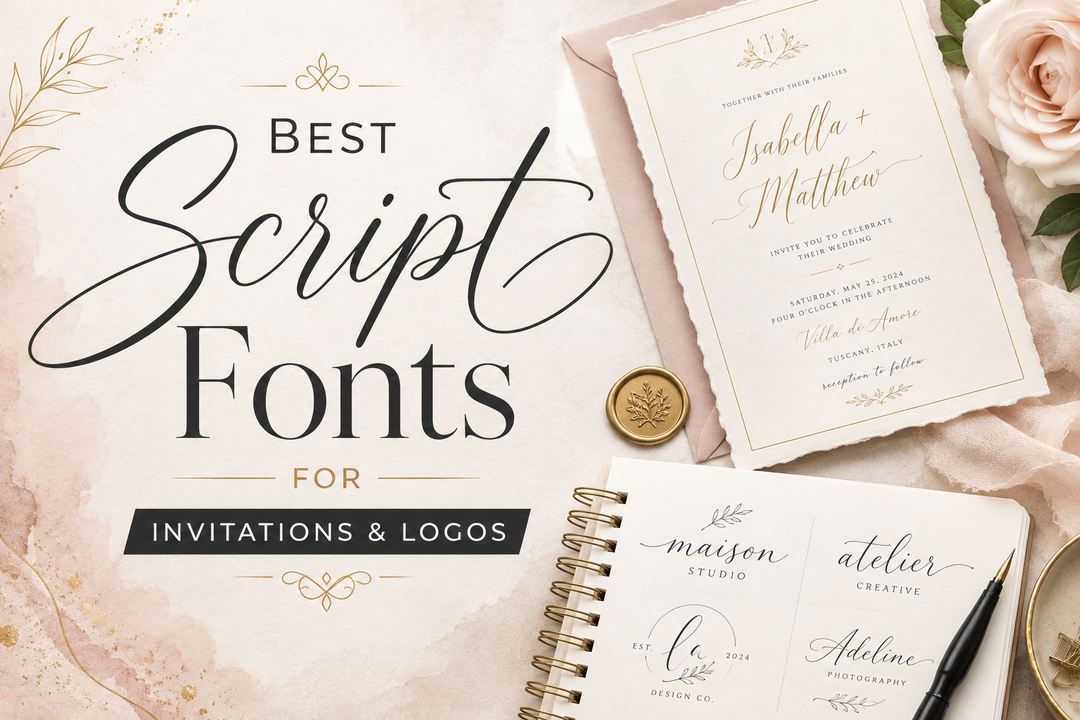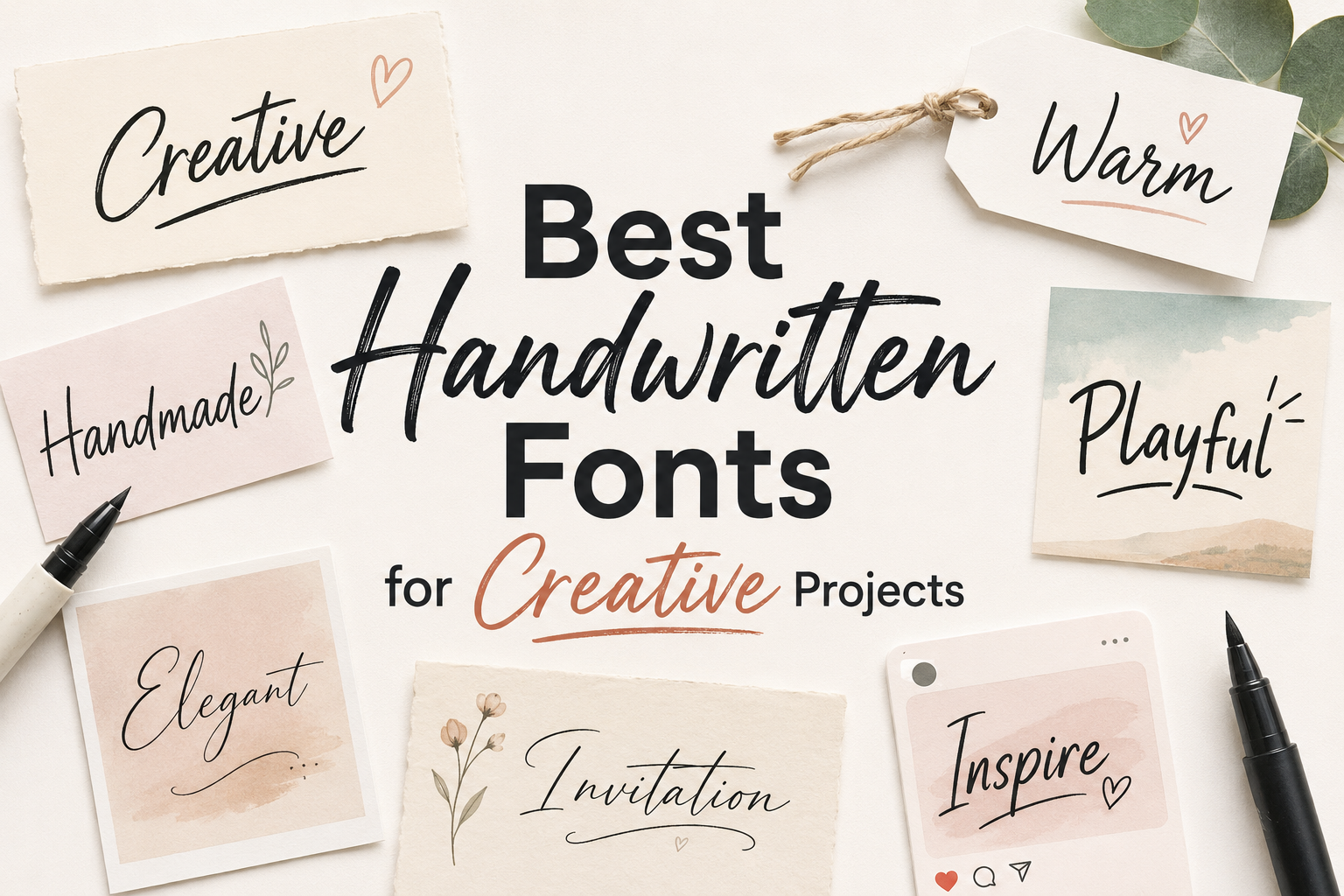
Handwritten fonts can quickly change the feeling of a design. A clean sans serif may look modern and professional, but a handwritten typeface can make the same layout feel more personal, warm, expressive, or handmade. That is why handwritten fonts are often used in creative projects such as logos, invitations, social media graphics, packaging, posters, quote designs, craft labels, and casual branding.
The key is choosing the right handwritten font for the right purpose. Some handwritten fonts feel playful and bold. Others feel elegant, thin, artistic, rough, or organic. A font that works beautifully for a short quote may not work well for small product information. A font that looks stylish in a logo may be too decorative for a full paragraph.
This collection highlights some of the best handwritten fonts for creative projects, with a focus on visual mood, readability, and practical use. Before using any font in a real project, always preview it with your own words, check uppercase and lowercase letters, test numbers and punctuation, and review the license terms carefully—especially for commercial work.
Why Handwritten Fonts Work Well in Creative Design
Handwritten fonts are useful because they add a human touch. They can make a design feel less mechanical and more personal, which is helpful when the project needs warmth, emotion, or creative personality.
For example, a handwritten font can make a wedding invitation feel more intimate, a product label feel more handmade, a quote graphic feel more expressive, or a social media post feel more casual and friendly. They are especially effective when used for short text: names, titles, logo words, packaging labels, short quotes, stickers, badges, and display headings.
Still, handwritten fonts need careful use. They usually work best as accent fonts, not as paragraph fonts. If a design includes long text, pair the handwritten font with a clean serif or sans serif for the body copy. This keeps the layout readable while still giving the design a personal style.
Best Handwritten Fonts to Try
1. Jeany Gifary
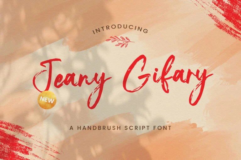
Jeany Gifary has a loose brush style with thin strokes, quick movement, and a slightly raw handwritten rhythm. It feels expressive rather than polished, which makes it suitable for designs that need an artistic or spontaneous touch.
This font can work well for personal branding, creative signatures, quote graphics, mood boards, handmade product labels, and social media posts with a casual lifestyle feel. Its brush-like texture gives the letters energy, so it can be useful when a design needs to look personal and expressive without becoming too heavy.
For readability, Jeany Gifary is better for short phrases than long sentences. The thin, energetic strokes may lose clarity at very small sizes, especially on busy backgrounds. Before using it, test your exact words in both lowercase and uppercase. The uppercase style has a more dramatic handwritten look, so it may be best for short display text rather than detailed information.
License note: Jeany Gifary is listed as free for personal use. Check the font page and the author’s license terms before using it in commercial projects.
2. Maguire
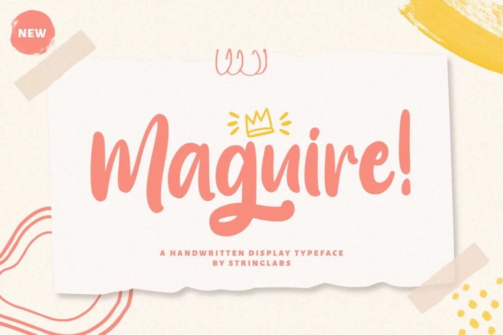
Maguire has a bold, rounded handwritten style that feels friendly, confident, and playful. Compared with thinner handwritten fonts, it has stronger visual weight, which makes it easier to notice in a design.
This font is a good fit for posters, children’s creative projects, casual branding, stickers, food packaging, playful logos, and social media graphics. Its bold letters can help a headline stand out without feeling too formal. It also has a handmade personality that can make a design feel approachable.
Maguire is more readable than many thin handwritten fonts because of its thicker strokes. That makes it useful for short titles and display text. However, it still has a decorative handwritten personality, so it should not be used for long paragraphs or dense informational text. Pair it with a simple sans serif font if your design needs descriptions, product details, or captions.
License note: Maguire is listed as free for personal use. Review the font page and author license terms before using it in commercial projects.
3. Ronald Flick
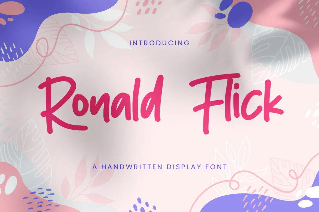
Ronald Flick has a rough, marker-like handwritten feel with irregular strokes and a strong casual attitude. It looks energetic and slightly rebellious, making it useful for designs that need movement, youthfulness, or handmade character.
This font can work well for music posters, street-style graphics, casual apparel designs, quote posters, creative banners, and bold social media content. It has enough personality to become the main visual element in a layout, especially when used for short uppercase text.
Because Ronald Flick has an expressive handwritten structure, readability depends on size and spacing. It works better for short words, punchy phrases, and large headings. Avoid using it for small labels or important details where every letter must be instantly clear. If you use it in a poster or thumbnail, give it enough space so the irregular strokes can breathe.
License note: Ronald Flick is listed as free for personal use. Always check the font page and author license before commercial use.
4. Sabtu Minggu
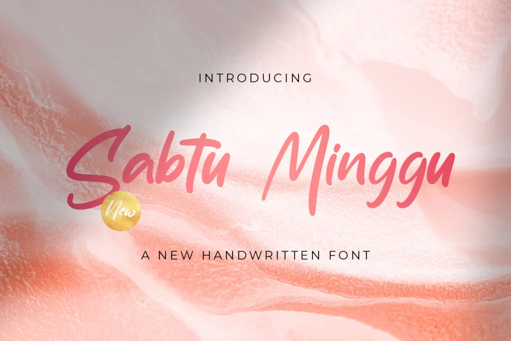
Sabtu Minggu has a slim handwritten style with a relaxed, slightly slanted rhythm. It feels casual, light, and personal, making it suitable for creative projects that need a softer handmade mood.
This font is a good option for journaling-style graphics, simple quotes, personal notes, invitation accents, blog graphics, and lifestyle social media posts. It does not feel overly decorative, which can be useful when you want a handwritten font that looks natural rather than dramatic.
For readability, Sabtu Minggu works best in short lines and medium-to-large sizes. Its thinner strokes may become weak if placed over textured backgrounds or used too small. Use it for titles, short quotes, or decorative text, then combine it with a clean serif or sans serif for supporting copy.
License note: Sabtu Minggu is listed as free for personal use. Check the font page and author license terms before using it commercially.
5. Sang Bintang
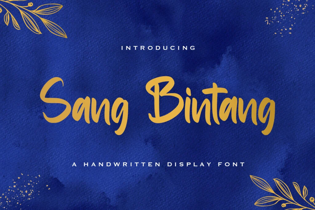
Sang Bintang has a neat handwritten style with moderate thickness and a casual brush feel. It feels friendly, informal, and easygoing, which makes it useful for designs that need a handmade personality without becoming too messy.
This font can be used for simple logo concepts, packaging labels, quote graphics, social media posts, handmade crafts, and casual product branding. Its handwritten character gives the design warmth, while its relatively clear letter shapes help maintain readability in short display text.
Sang Bintang is a practical choice when you want a handwritten font that feels expressive but still controlled. Use it for short titles, product names, and label-style text. For longer information, keep the handwritten font as the accent and use a cleaner font for the main reading text.
License note: Sang Bintang is listed as free for personal use. Review the font page and license terms before commercial use.
6. Sanju Vony
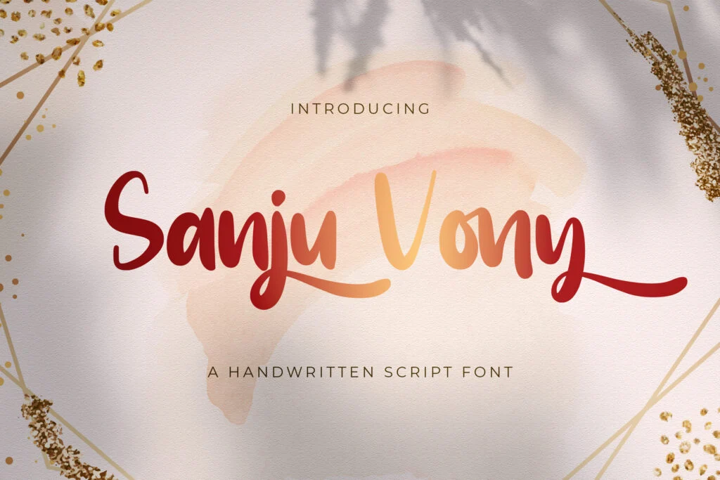
Sanju Vony has a bold handwritten look with rounded, friendly strokes. It feels playful and confident, making it useful for creative designs that need a cheerful and approachable tone.
This font fits well in social media graphics, casual logos, food-related designs, packaging labels, children’s designs, stickers, and short promotional headlines. It has enough weight to stand out, so it can be used as the main title font in a design.
In terms of readability, Sanju Vony is suitable for short headings and display phrases. The bold handwritten style gives it strong presence, but it should still be tested carefully in smaller sizes. If your project includes numbers, prices, dates, or short product details, preview those characters before deciding to use it.
License note: Sanju Vony is listed as free for personal use. Check the font page and author license terms before using it for commercial projects.
7. Sugano
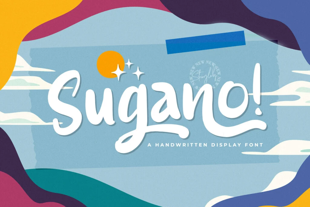
Sugano has a thick handwritten style with bold strokes and a lively casual shape. It feels friendly, fun, and expressive, making it suitable for creative projects that need strong personality.
This font can work well for poster titles, quote graphics, playful branding, food packaging, craft labels, event graphics, and social media designs. Its heavier weight makes it more visible than thinner handwritten fonts, especially in display layouts.
Sugano is a good choice for short text that needs impact. It is not ideal for long paragraphs because the handwritten style can become tiring when repeated across many lines. For a balanced layout, use Sugano for the main title and pair it with a plain sans serif font for descriptions, instructions, or longer captions.
License note: Sugano is listed as free for personal use. Always review the font page and author license before using it commercially.
8. Susanow
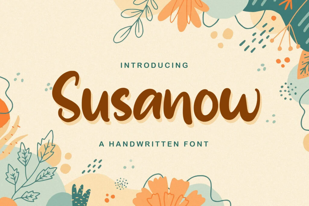
Susanow has a bold handwritten style with an organic, slightly uneven flow. It feels casual, friendly, and handmade, making it useful for designs that need warmth and personality.
This font can fit product labels, handmade business branding, social media quotes, casual posters, food designs, and packaging concepts. It has a strong enough presence for titles but still keeps a relaxed handwritten mood.
For readability, Susanow works best in larger sizes and short phrases. The uppercase letters are more decorative and expressive, so they may be useful for headlines but less suitable for detailed information. Before using it in a real project, test the exact wording, especially if your design includes names, numbers, or punctuation.
License note: Susanow is listed as free for personal use. Check the font page and author license terms before commercial use.
9. Holland Gateway
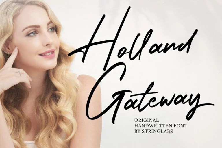
Holland Gateway has a thin handwritten script style with a more elegant and delicate appearance. It feels artistic, light, and personal, which makes it different from the bolder handwritten fonts in this collection.
This font can work well for wedding designs, elegant invitations, signature-style logos, boutique branding, personal stationery, thank-you cards, and soft editorial graphics. Its thin strokes can give a design a refined handmade touch.
The main thing to watch is readability at small sizes. Holland Gateway is better for short names, signature marks, and decorative accents than for important information. Use plenty of contrast between the text and background. Avoid placing it over busy textures, and check how the letters connect in your own wording before downloading.
License note: Holland Gateway is listed as free for personal use. Review the font page and author license terms before using it commercially.
10. Amantta Organic Handwritten
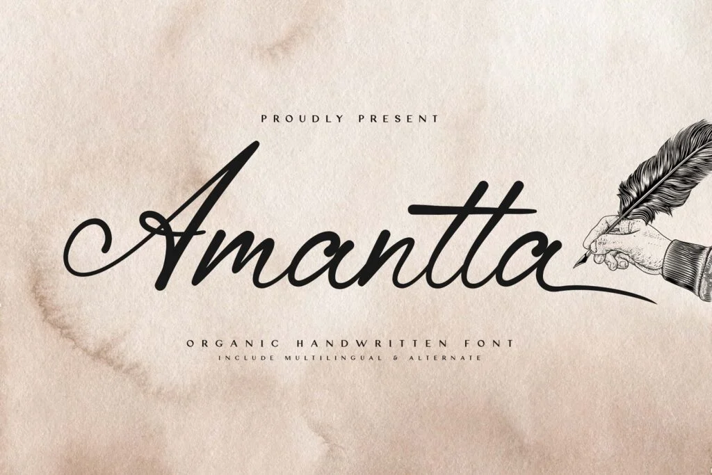
Amantta Organic Handwritten has a thin, flowing handwritten style with an elegant and organic feel. It looks more refined than casual marker-style fonts, making it suitable for projects that need a graceful handmade impression.
This font is a good match for invitations, romantic quotes, feminine branding, boutique packaging, personal logos, greeting cards, and lifestyle graphics. It can help a design feel softer and more personal without looking too playful.
Because Amantta Organic Handwritten has thin strokes and decorative movement, it should be used carefully. It works best for short display text, names, headings, or accent phrases. Avoid using it for long paragraphs or small product details. If you use it in branding, pair it with a clean serif or minimal sans serif to keep the overall design readable.
License note: Amantta Organic Handwritten is listed as free for personal use. Check the font page and author license terms before commercial use.
11. Santtuy
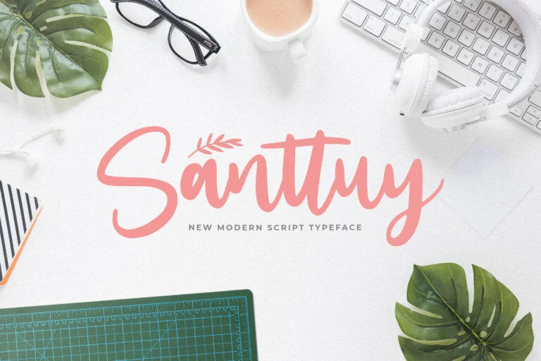
Santtuy has a casual handwritten style with tall, expressive shapes and a handmade brush feel. It sits between playful and stylish, making it useful for creative layouts that need energy without looking too heavy.
This font can work well for quote posters, creative social media posts, handmade labels, casual branding, stickers, and event graphics. Its personality is strong enough for display use, especially when the text is short and given enough space.
Santtuy is better for headlines and short phrases than small text. Some handwritten letters may need extra spacing depending on the word, so test your actual title before using it in a final layout. If the project includes important details, use a simpler companion font for the supporting information.
License note: Santtuy is listed as free for personal use. Review the font page and author license terms before using it commercially.
12. Sattomy
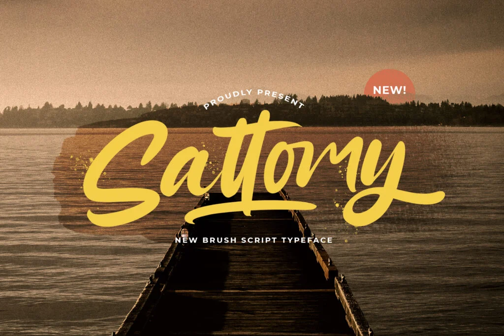
Sattomy has a bold handwritten style with a slightly textured, energetic look. It feels confident, casual, and expressive, making it a strong option for designs that need attention.
This font can be used for poster headlines, quote graphics, packaging labels, casual logo concepts, apparel designs, and bold social media visuals. It has good visual weight, so it can stand out well in large display settings.
For readability, Sattomy is strongest in short text. It can work well for titles, names, and short phrases, but it may feel too decorative for long copy. Give the letters enough spacing, avoid crowded layouts, and test uppercase text carefully if you plan to use it as a main headline.
License note: Sattomy is listed as free for personal use. Check the font page and author license terms before using it in commercial projects.
How to Choose the Right Handwritten Font
Start with the mood of the project. A wedding invitation may need a thin, elegant handwritten script, while a food label may need something bolder and friendlier. A children’s craft design can use a playful handwritten font, but a boutique logo may need something softer and more refined.
Readability should come before decoration. A handwritten font may look beautiful in a preview, but it still needs to work with your actual words. Test the font using the real brand name, quote, title, or label text you plan to use. Some fonts look great with sample sentences but become harder to read with certain letter combinations.
Also check the full character set. Uppercase, lowercase, numbers, punctuation, and symbols can vary a lot in handwritten fonts. If your design includes dates, prices, social handles, product sizes, or short instructions, make sure those characters match the quality of the letters.
For most designs, one handwritten font is enough. Using several handwritten fonts together often makes the layout feel messy. A better approach is to pair one expressive handwritten font with a clean sans serif or simple serif. The handwritten font can handle the title or logo word, while the simpler font supports body text, descriptions, or small details.
Font License Reminder
All fonts in this list are described with the license information provided in the font data. The listed fonts are free for personal use, so do not assume they are safe for commercial work.
If you plan to use a font for a client project, logo, product packaging, paid social media design, merchandise, template, digital product, or business branding, check the font page and the author’s license terms first. Some fonts may require a commercial license, and the allowed usage can vary by author.
Related Font Categories and Guides
For more handwritten-style options, you can explore the Handwritten Fonts category.
If you are not sure which font file format to choose, read this guide: OTF vs TTF: What Is the Difference?. It can help you understand common font formats before downloading and installing fonts.
FAQ
What are handwritten fonts best used for?
Handwritten fonts are best for short, expressive text such as logos, invitations, quotes, packaging labels, posters, stickers, greeting cards, and social media graphics. They are useful when a design needs to feel personal, handmade, casual, artistic, or warm.
Can I use handwritten fonts for paragraphs?
It is usually better not to use handwritten fonts for long paragraphs. Many handwritten fonts are decorative, irregular, or highly stylized, which can make long text harder to read. Use them for headings or accents, then pair them with a simple serif or sans serif for body text.
Are these handwritten fonts free for commercial use?
The fonts in this collection are listed as free for personal use. That does not automatically mean they are free for commercial use. Always check the font page and the author’s license terms before using any font in business, client, or commercial projects.
How do I choose a readable handwritten font?
Test the font with your own words before downloading. Check uppercase letters, lowercase letters, numbers, punctuation, and spacing. A readable handwritten font should still be clear at the size you plan to use, especially for labels, thumbnails, packaging, or social media graphics.
What fonts pair well with handwritten fonts?
Handwritten fonts usually pair well with simple sans serif or clean serif fonts. Avoid pairing them with another decorative font that competes for attention. Let the handwritten font be the expressive part of the design, and use the simpler font for supporting text.
Final Thoughts
The best handwritten fonts are not only stylish; they also need to match the mood, audience, and purpose of the project. A bold handwritten font can make a poster feel energetic, while a thin script can make an invitation feel elegant. A casual handwritten typeface can make packaging feel friendly, but it may not be suitable for small product details.
Use handwritten fonts with intention. Keep them for titles, short phrases, logos, labels, quotes, and accents. Test your real text, check the character set, pair the font with something simple, and always review the license before using it commercially.