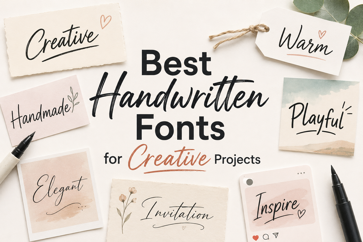
Poster headlines have one main job: stop people long enough to read the message. Whether you are designing a music flyer, event poster, sports graphic, Halloween promotion, product launch visual, or social campaign, the headline font often sets the first impression before color, layout, or copy can do their work.
That is why choosing the right display font matters. Display fonts are made for impact. They are usually more expressive than standard text fonts, with stronger shapes, decorative details, unusual proportions, or a clear visual mood. For poster design, they can help communicate energy, fun, mystery, elegance, danger, speed, or playfulness in just a few words.
Below is a practical collection of display fonts for poster headlines, selected with readability and visual mood in mind. Some are bold and loud, while others are decorative, spooky, sporty, futuristic, or playful. Before using any font in a client or commercial project, always review the license on the font page and the author’s license terms.
What Makes Display Fonts Useful for Poster Headlines?
A good poster headline font needs to do more than look interesting. It should fit the message, remain readable at a glance, and work well with the surrounding design.
For posters, display fonts are especially useful because they can:
Create a strong mood quickly, even before the viewer reads the full text.
Make short headlines feel more memorable and distinctive.
Support specific themes such as horror, sports, kids’ events, gaming, street art, futuristic branding, or vintage-inspired design.
Give designers and freelancers more creative range when building poster concepts for different clients.
The key is balance. A decorative font may be perfect for a three-word headline but difficult for a long sentence. Before downloading, test the font with your actual poster wording. Check uppercase, lowercase, numbers, punctuation, and symbols, especially if your design includes dates, prices, event times, or social handles.
Best Display Fonts for Poster Headlines
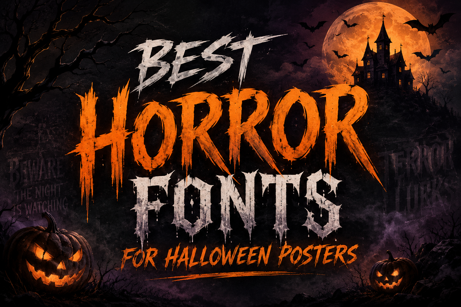
1. Rubik Wet Paint
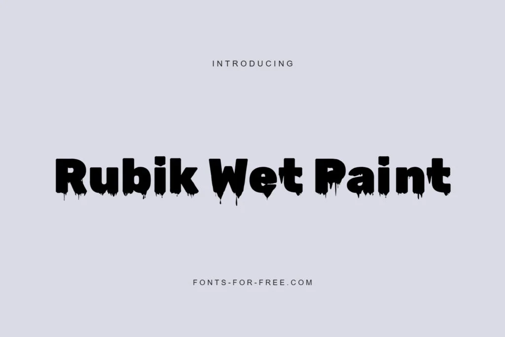
Rubik Wet Paint is a dark, spooky display font with heavy letterforms and dripping, rough-edged details. It has a strong horror-poster personality, making it a good choice for Halloween events, haunted house flyers, mystery-themed graphics, scary movie posters, or bold music artwork.
Because the shapes are thick and dramatic, Rubik Wet Paint works best for short headlines rather than long blocks of text. Use it when you want the title to feel intense, mysterious, or slightly chaotic. It can hold attention well, but the distressed edges mean you should give the letters enough space and avoid placing them over busy backgrounds.
License provided: Public domain / OFL. Still, check the font page and license file before commercial use.
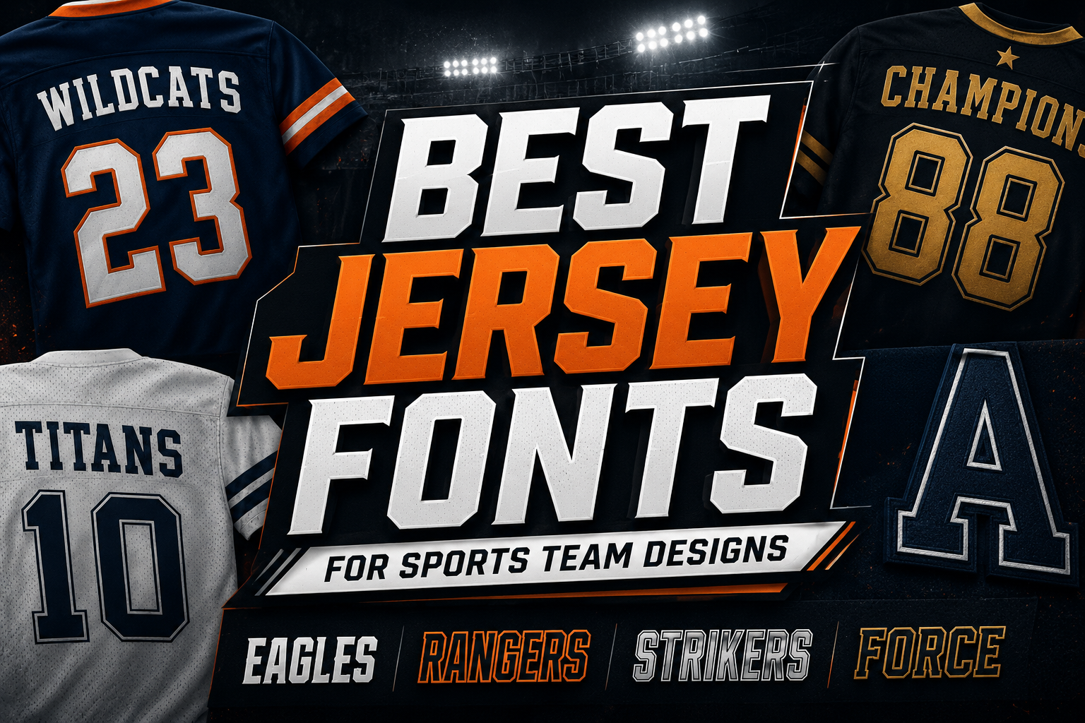
2. Carlitos Font Sporty Display
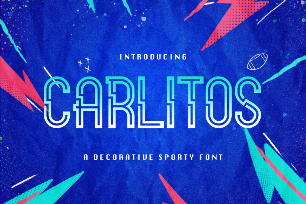
Carlitos Font Sporty Display has an outlined, athletic look that feels energetic and modern. Its open line structure gives it a scoreboard, jersey, or sports branding feel, which makes it suitable for tournament posters, gym promotions, racing graphics, team announcements, and bold event headlines.
The outline style can be visually striking, especially at large sizes. However, outlined fonts usually need good contrast to stay readable. For poster work, pair Carlitos with a clean background or add a solid shadow, color block, or stroke treatment if the design feels too light.
License provided: Free for personal use. Review the author’s terms before using it for client work or commercial projects.
3. Super Guardian Futuristic Sans Font
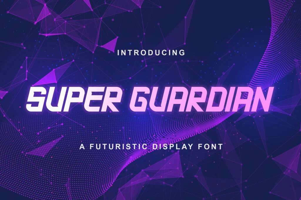
Super Guardian Futuristic Sans Font is built for speed, technology, and forward motion. It has a sharp, angular sans style with a futuristic attitude, making it useful for esports posters, sci-fi events, tech promotions, gaming thumbnails, digital launches, and action-focused graphics.
Its strong slant and geometric cuts give headlines momentum. This font is best when the design needs to feel fast, competitive, or high-energy. For readability, keep the headline short and avoid squeezing the letters too tightly. It pairs well with simple sans-serif body text so the poster does not become too visually busy.
License provided: Free for personal use. Confirm the license terms before any commercial use.
4. Osake Font
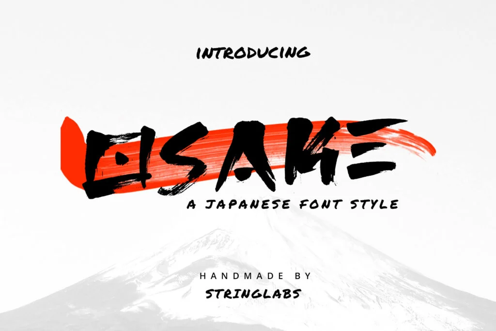
Osake Font brings a handmade brush style with rough, expressive strokes. It has an energetic, handcrafted mood that can work well for Japanese-inspired posters, food promotions, martial arts events, music flyers, streetwear graphics, or creative cultural designs.
Osake feels bold and imperfect in a good way. The brush texture gives it movement, but that same texture can reduce clarity if the headline is too long or too small. Use it for large titles, short phrases, and designs where personality matters more than strict polish.
License provided: Free for personal use. Check the font page and author license terms before using it commercially.
5. Theory Display Font
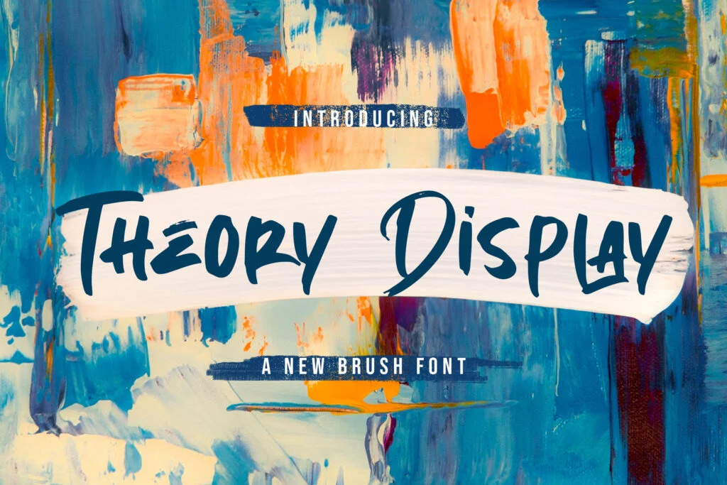
Theory Display Font is a textured brush font with a loose, handwritten feel. It is expressive without feeling too heavy, which makes it a useful option for creative posters, personal branding graphics, workshop flyers, lifestyle events, music promotions, and casual editorial-style headlines.
Compared with heavier horror or novelty fonts, Theory feels more flexible and human. It can add movement and warmth to a poster headline while still remaining fairly approachable. For best results, use it with clean supporting typography and avoid setting long paragraphs in it.
License provided: Free for personal use. Review the font page and license terms before commercial or client work.
6. Eater
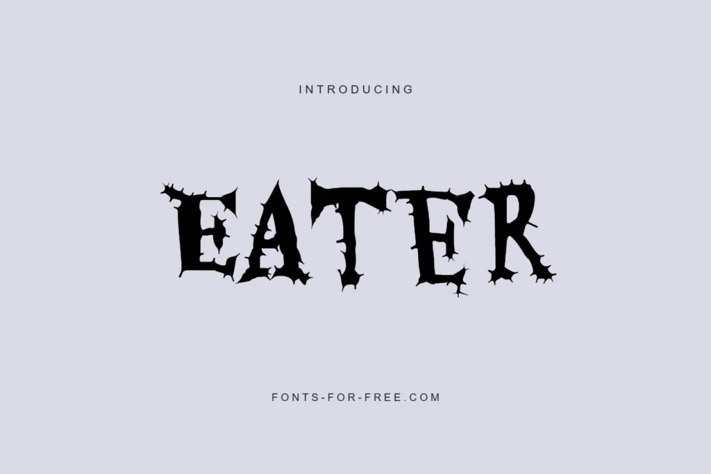
Eater is a dramatic display font with a rough, gothic, monster-like personality. It feels theatrical and unsettling, making it a strong option for horror posters, dark fantasy graphics, Halloween campaigns, haunted attractions, and dramatic event titles.
This font has a lot of visual detail, so it should be treated as a headline-only choice. It can be very effective when used large, with generous spacing and strong contrast. Avoid using it for small supporting text, because the decorative edges may become harder to read.
License provided: Public domain / OFL. Even with this license note, it is still smart to review the font page and included license before commercial use.
7. Buztery
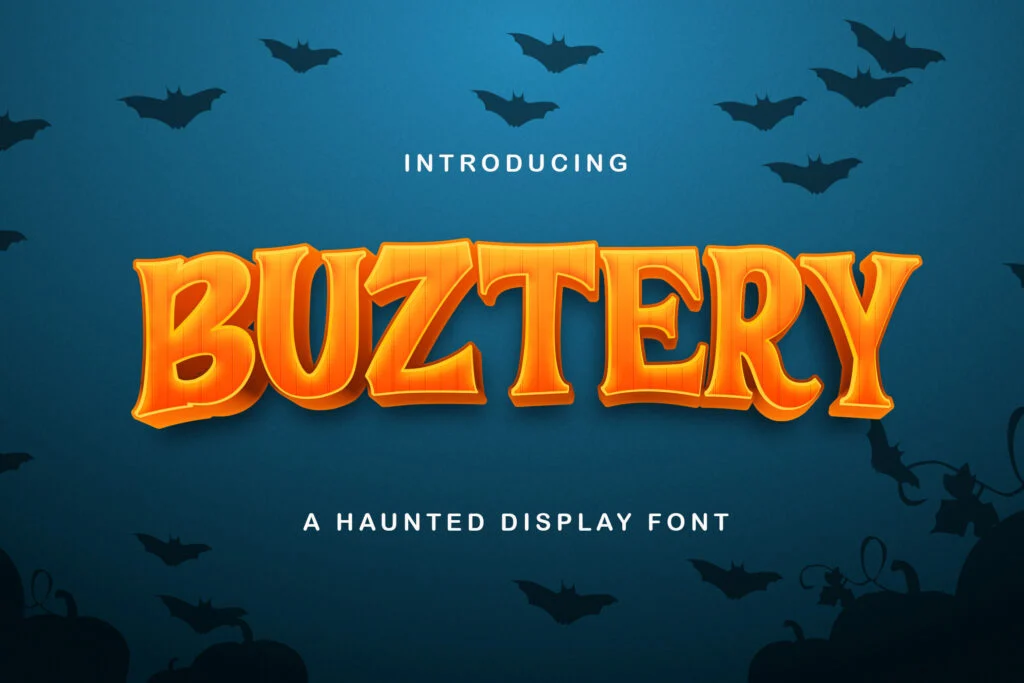
Buztery has a decorative serif style with playful curves and strong vintage character. It feels bold, quirky, and slightly retro, which makes it suitable for festival posters, boutique branding graphics, food packaging concepts, children’s event posters, and creative promotional headlines.
Buztery stands out because it offers personality without relying on rough texture or extreme distortion. Its letterforms are decorative, but the overall structure is still clear enough for poster headlines. It is a good choice when you want something fun and memorable but not too aggressive.
License provided: Free for personal use. Check the author’s license before using it in paid or commercial projects.
8. Chewy
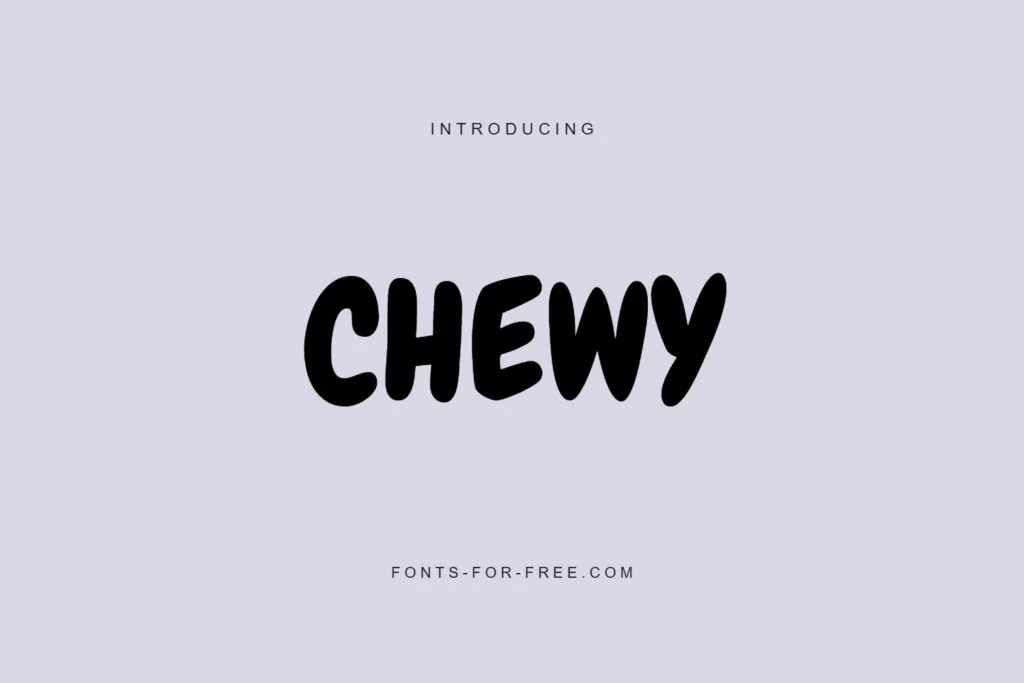
Chewy is round, friendly, and playful. It has a soft, bouncy look that works well for children’s posters, food graphics, school events, craft workshops, cheerful social posts, and fun brand promotions.
The main strength of Chewy is its approachable mood. It does not feel formal or serious, so it is best for designs that need warmth, humor, or friendliness. Its thick letterforms are easy to notice, but because the style is casual, it may not be the right fit for luxury, corporate, or minimalist poster designs.
License provided: Public domain / OFL. Check the font page and license file before using it commercially.
9. Butcherman
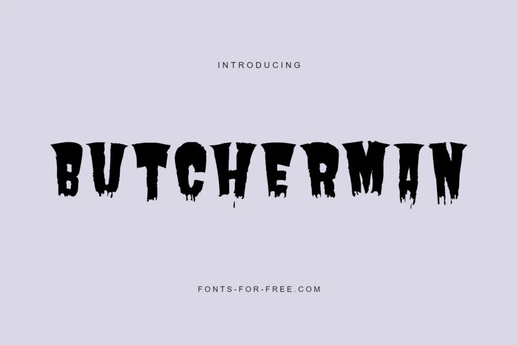
Butcherman is another strong choice for horror and dark-themed poster headlines. It has heavy, jagged, distressed shapes that feel rough, creepy, and intentionally imperfect.
This font is best used when the headline needs to feel threatening, strange, or dramatic. It can work for Halloween parties, scary movie nights, haunted attractions, metal band posters, or themed social graphics. Because of its rough texture, use it at larger sizes and keep the wording short for better readability.
License provided: Public domain / OFL. Always confirm the exact license terms on the font page before commercial use.
10. Revij Anovik Decorative Serif Font
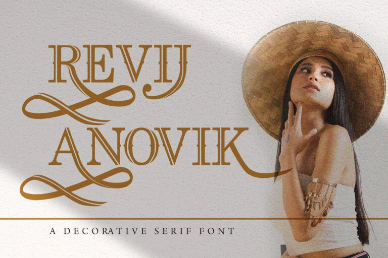
Revij Anovik Decorative Serif Font has an elegant decorative serif appearance with layered internal lines. It feels more refined than many bold novelty display fonts, making it useful for vintage posters, boutique event graphics, editorial headlines, art exhibitions, invitations, and premium-looking promotional designs.
This font is a good option when you want a poster headline to feel stylish and ornamental without becoming messy. The decorative linework gives it character, but designers should be careful with small sizes. Let the letters breathe and avoid placing them on complex backgrounds.
License provided: Free for personal use. Review the author’s license before using it in commercial work.
11. Fun Games Futuristic Display Font
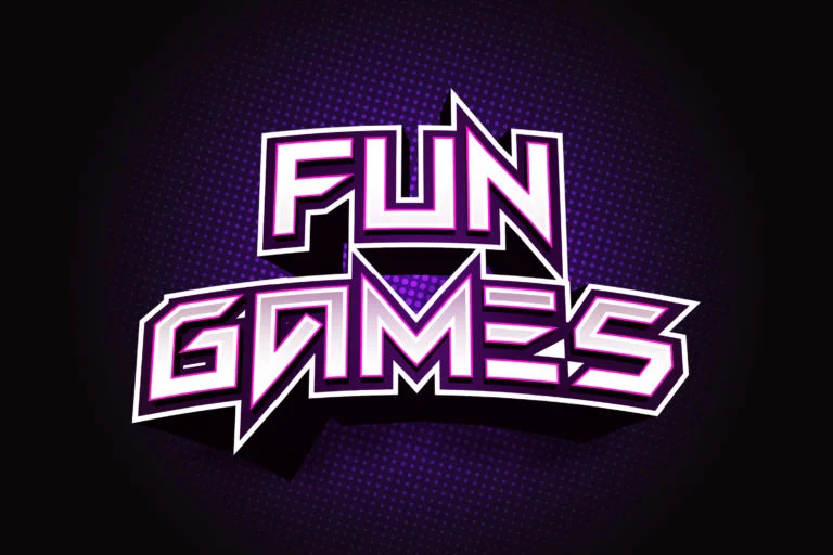
Fun Games Futuristic Display Font is angular, bold, and highly stylized. It has a gaming and sci-fi feel, making it a natural fit for esports posters, arcade events, futuristic branding, technology promotions, and digital entertainment graphics.
Its sharp geometry gives headlines a strong visual identity. Because the letter shapes are more experimental, it works best for short words or compact headlines. Test your exact wording before committing, especially if the poster needs to be read quickly from a distance.
License provided: Free for personal use. Check the font page and author terms before using it commercially.
12. Helloo Kidos Playful Display Font
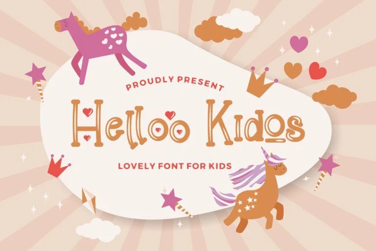
Helloo Kidos Playful Display Font is cheerful, decorative, and child-friendly. It has a hand-drawn quality that makes it suitable for school posters, kids’ activities, family events, classroom graphics, playful product promos, and children’s party invitations.
This font works well when the design needs to feel light, friendly, and imaginative. Its decorative shapes add charm, but the style is not meant for serious corporate or formal posters. Use it for large titles, then pair it with a simple supporting font for details like date, venue, and contact information.
License provided: Free for personal use. Review the full license before any commercial use.
How to Choose the Right Display Font for a Poster
Start with the poster’s mood. A horror event may need Rubik Wet Paint, Eater, or Butcherman, while a kids’ workshop may feel better with Chewy or Helloo Kidos. For sports and action themes, Carlitos or Super Guardian can create more energy. For futuristic or gaming designs, Super Guardian and Fun Games are stronger fits.
Next, test readability. A font can look exciting in isolation but become difficult when used in a real headline. Type your actual words, including numbers and punctuation. This is especially important for posters that include dates, times, prices, or location details.
Also consider hierarchy. Your display font should usually handle the main headline, not every piece of text. Pair it with a clean sans-serif or readable serif for the supporting information. This keeps the poster visually interesting without making it hard to scan.
Finally, think about scale. Some fonts look best very large, where their details are easy to appreciate. Others may remain readable at medium sizes. If the poster will be used both in print and on social media, test it at different sizes before finalizing the design.
Font License Reminder
Licensing is important, especially for freelancers and graphic designers working with clients. Some fonts in this collection are listed as Public domain / OFL, while others are listed as Free for personal use. Do not assume personal-use fonts are allowed in paid client projects, advertising, merchandise, branding, or commercial campaigns.
Before downloading and using any font, check the font page, read the included license terms, and follow the author’s requirements. When in doubt, contact the font author or choose a font with a clearly suitable license for your project.
Related Font Categories and Guides
For more options, browse the broader collection of display fonts. This category is useful when you need headline fonts with stronger personality than standard body text fonts, especially for posters, flyers, social graphics, logos, and promotional design projects.
FAQ
What are display fonts best used for?
Display fonts are best used for large, attention-grabbing text such as poster headlines, flyer titles, logos, packaging, banners, thumbnails, and social media graphics. They are usually not ideal for long paragraphs because many display fonts are highly decorative.
Are display fonts good for professional poster design?
Yes, display fonts can be excellent for professional poster design when used carefully. The key is choosing a font that matches the message and remains readable. Use display fonts for the main headline, then use simpler fonts for supporting details.
How many display fonts should I use in one poster?
In most cases, one display font is enough. Using too many decorative fonts can make a poster feel messy. A strong display font paired with a clean supporting typeface usually creates better hierarchy and readability.
Can I use these fonts for commercial projects?
Only if the license allows it. Some fonts listed here are marked Public domain / OFL, while others are Free for personal use. Always check the individual font page and the author’s license terms before using a font in commercial or client work.
How do I know if a poster font is readable enough?
Test the font with your real headline, numbers, and symbols. View it at the size people will actually see it, both close up and from a distance. If viewers need extra time to understand the words, choose a simpler font or reduce the amount of decorative styling.
Conclusion
The best display fonts for poster headlines are the ones that combine mood with clarity. A strong font can make a design feel spooky, playful, futuristic, sporty, elegant, or energetic before the viewer reads anything else. For graphic designers and freelancers, that makes display fonts powerful tools for shaping the first impression of a project.
Use bold decorative fonts with intention, test them with your actual wording, and always check the license before using them commercially. With the right choice, your poster headline can become the visual anchor that makes the whole design work.