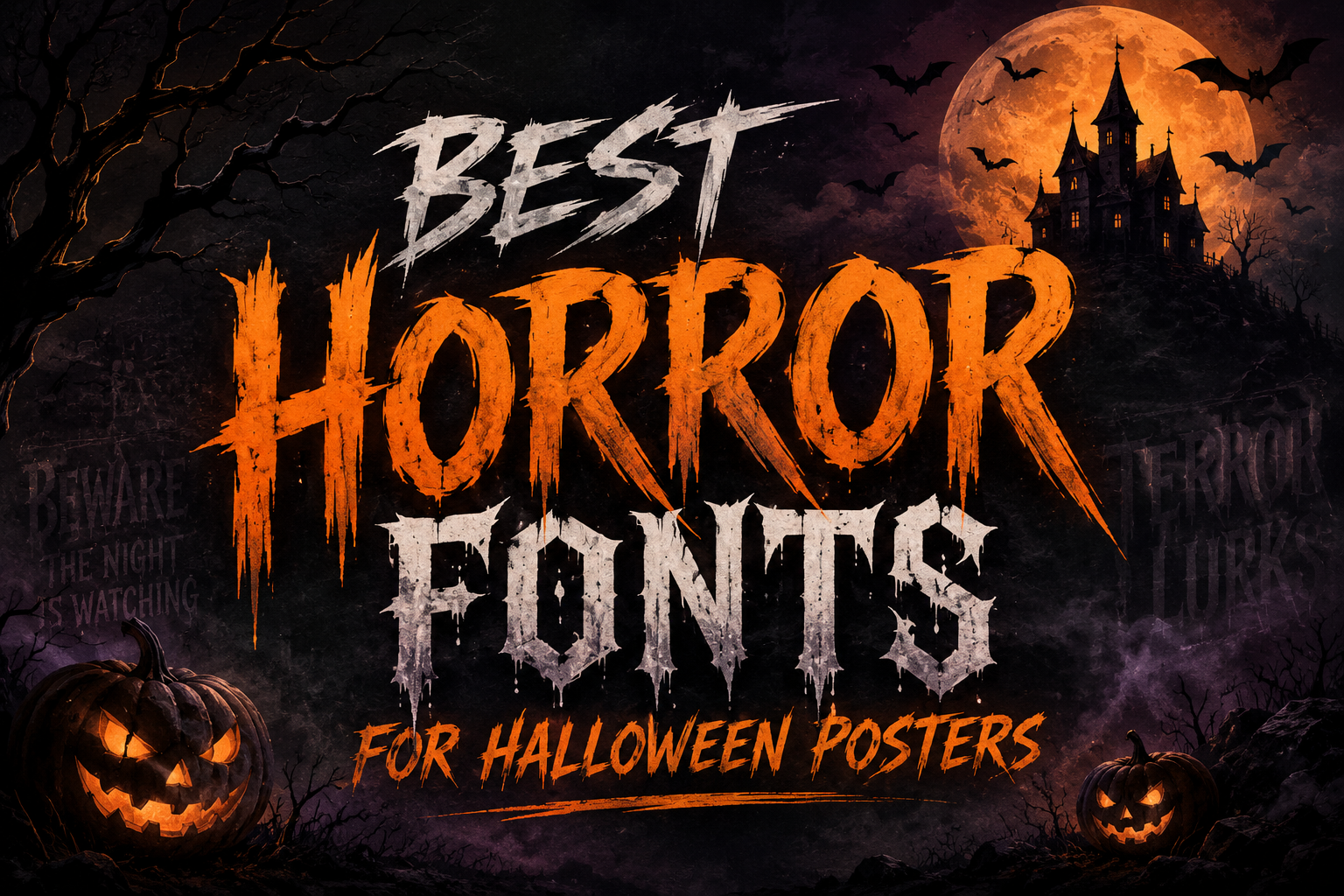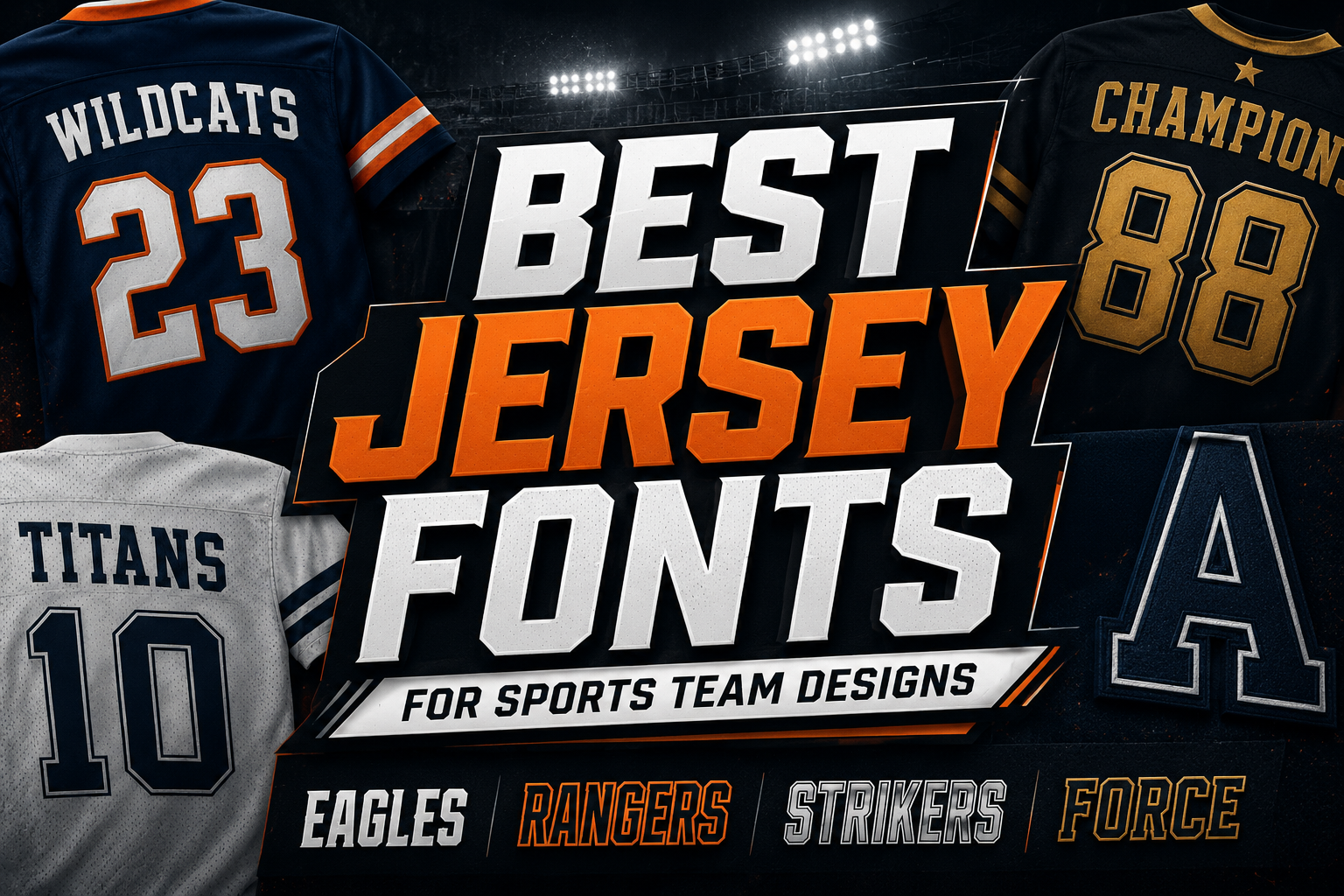
Jersey fonts need to do more than look bold. In sports design, the typeface has to carry identity, energy, and readability at the same time. A good jersey font should make a team name feel strong, make player numbers easy to recognize, and still work across uniforms, posters, logos, social media graphics, and merchandise.
This is especially important because sports typography is often viewed quickly. A player number may be seen from a distance. A team name may appear on a shirt, banner, or event poster. A logo may need to work on both a large print layout and a small digital graphic. That means the best jersey fonts are usually bold, structured, and display-focused, with strong uppercase letters and clear numbers.
Below are some sporty display fonts you can try for jersey-inspired designs. These fonts are especially useful for team names, athletic branding, player numbers, tournament posters, and bold merchandise graphics. Since the provided licenses are listed as free for personal use, always check the font page and the author’s license terms before using them for commercial work, client projects, printed products, or merchandise.
What Makes a Good Jersey Font?
A strong jersey font usually has three key qualities: readability, athletic personality, and number clarity.
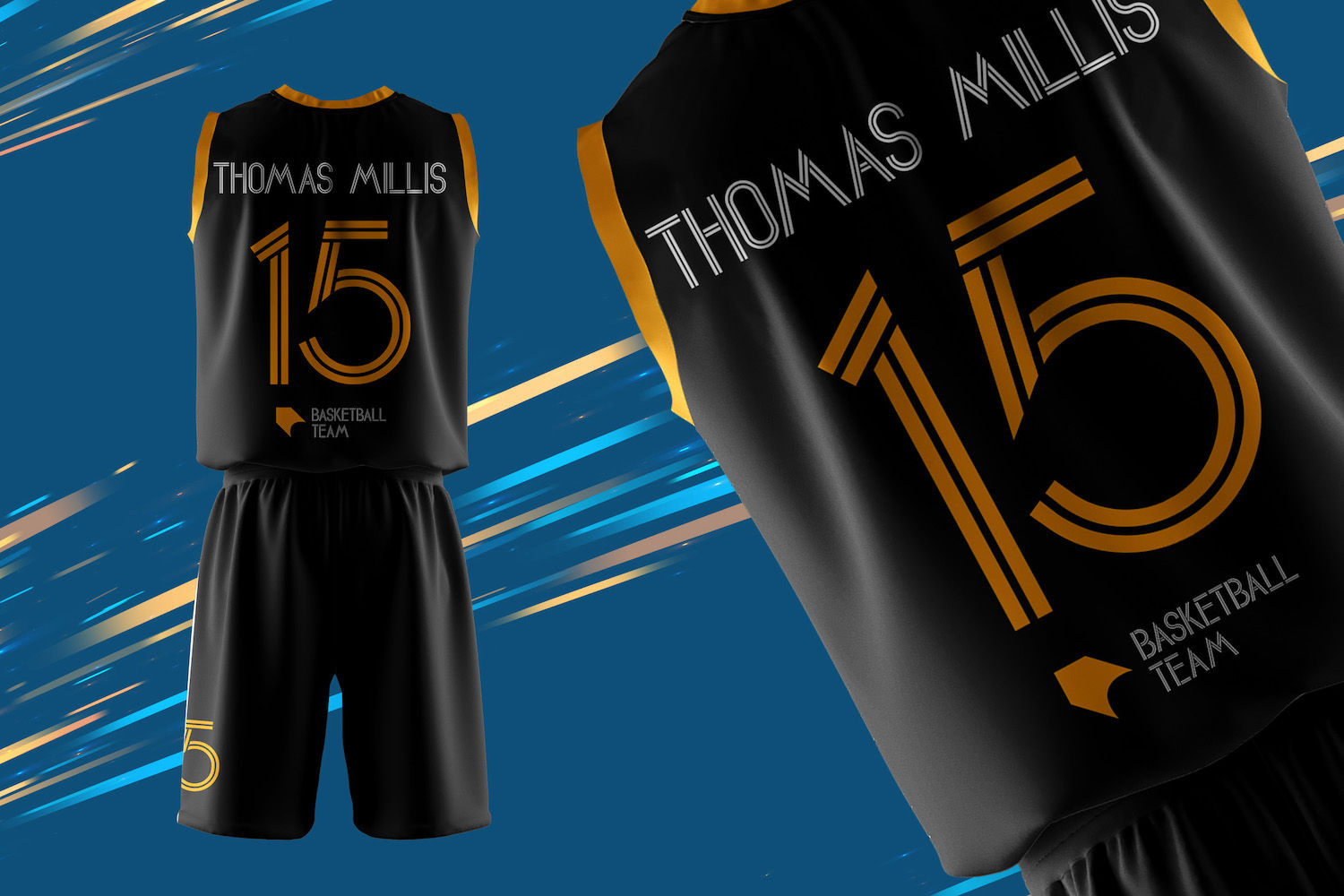
For sports uniforms, numbers are often just as important as letters. A font may look exciting in a team logo, but if the numbers are hard to read on a jersey, scoreboard graphic, or roster poster, it may not be the right choice. The best jersey fonts keep numbers bold, distinctive, and easy to tell apart.
Uppercase letters are also important because many team names are written in all caps. Words like “TIGERS,” “EAGLES,” “WARRIORS,” or “UNITED” need to feel confident and balanced. Lowercase letters matter too, especially for merchandise, social media captions, or secondary text where a full uppercase style may feel too heavy.
Jersey fonts are usually best for display text, not long paragraphs. Use them for names, numbers, headers, badges, and short slogans. For supporting text, pair them with a clean sans serif font so the overall design stays readable.
Best Jersey Fonts to Try
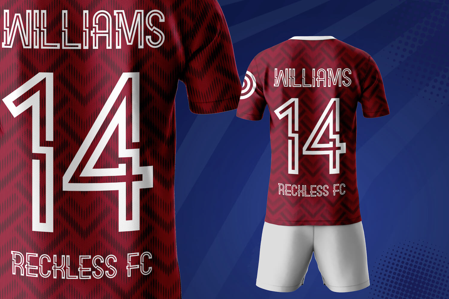
1. Virgiano Decorative Sporty Font
Virgiano Decorative Sporty Font has a sharp, athletic look with a decorative jersey-style structure. Its letterforms feel energetic and competitive, making it a good option for sports team branding, jersey names, event titles, and bold merchandise graphics.
The font works best when used for short words or display text. It has a sporty, blocky character, but the decorative details mean it should be tested carefully before using it for small text or long phrases. For team names, short slogans, and headline-style layouts, it can create a strong athletic impression.
Its numbers are useful for jersey-inspired designs, but designers should always test them in realistic layouts. Try placing numbers on a mock jersey, poster, or badge before finalizing the design. This helps you check whether each digit remains readable from a distance.
Virgiano Decorative Sporty Font is a display typeface in TTF format, designed by Stringlabs, and listed as free for personal use.
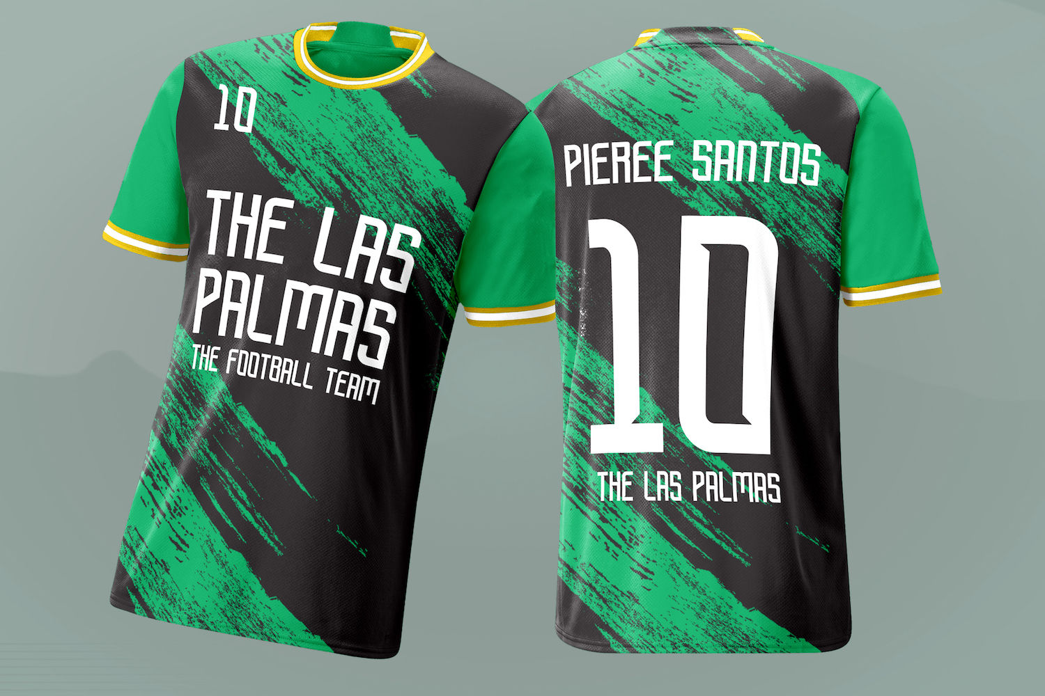
2. Carlitos Font Sporty Display
Carlitos Font Sporty Display has a clean sporty outline style that can work well for athletic titles, jersey graphics, and team identity concepts. It feels lighter than some heavy block fonts, which makes it useful when you want a sporty look without making the whole design feel too dense.
This font is especially suitable for display use, such as player name graphics, sports posters, team banners, and branding concepts. Its outlined style can work nicely when paired with bold colors, simple backgrounds, or layered effects.
Because Carlitos uses a more decorative construction, it is better for short text than body copy. Use it for team names, section headers, and number-focused layouts, then pair it with a plain sans serif font for descriptions, event details, dates, or sponsor text.
Carlitos Font Sporty Display is a display typeface in TTF format, designed by Stringlabs, and listed as free for personal use.
3. Bugar Sport Sporty Display Font
Bugar Sport Sporty Display Font has a strong sports identity with tall, structured letterforms. It feels modern, bold, and suitable for competitive team designs. The style works well for jersey names, tournament branding, team posters, and athletic logo concepts.
One of the strengths of this font is its display impact. It can make short team names feel confident and memorable. The uppercase letters are particularly useful for sports layouts where the typography needs to feel direct and powerful.
The numbers have a sporty, uniform-ready feel, making the font worth testing for player numbers and team rosters. However, like all decorative sports fonts, it should be checked at the actual size you plan to use. A number that looks good on a large poster may need more spacing or contrast on a printed jersey.
Bugar Sport Sporty Display Font is a display typeface in TTF format, designed by Stringlabs, and listed as free for personal use.
4. Sporticular Sporty Display Font
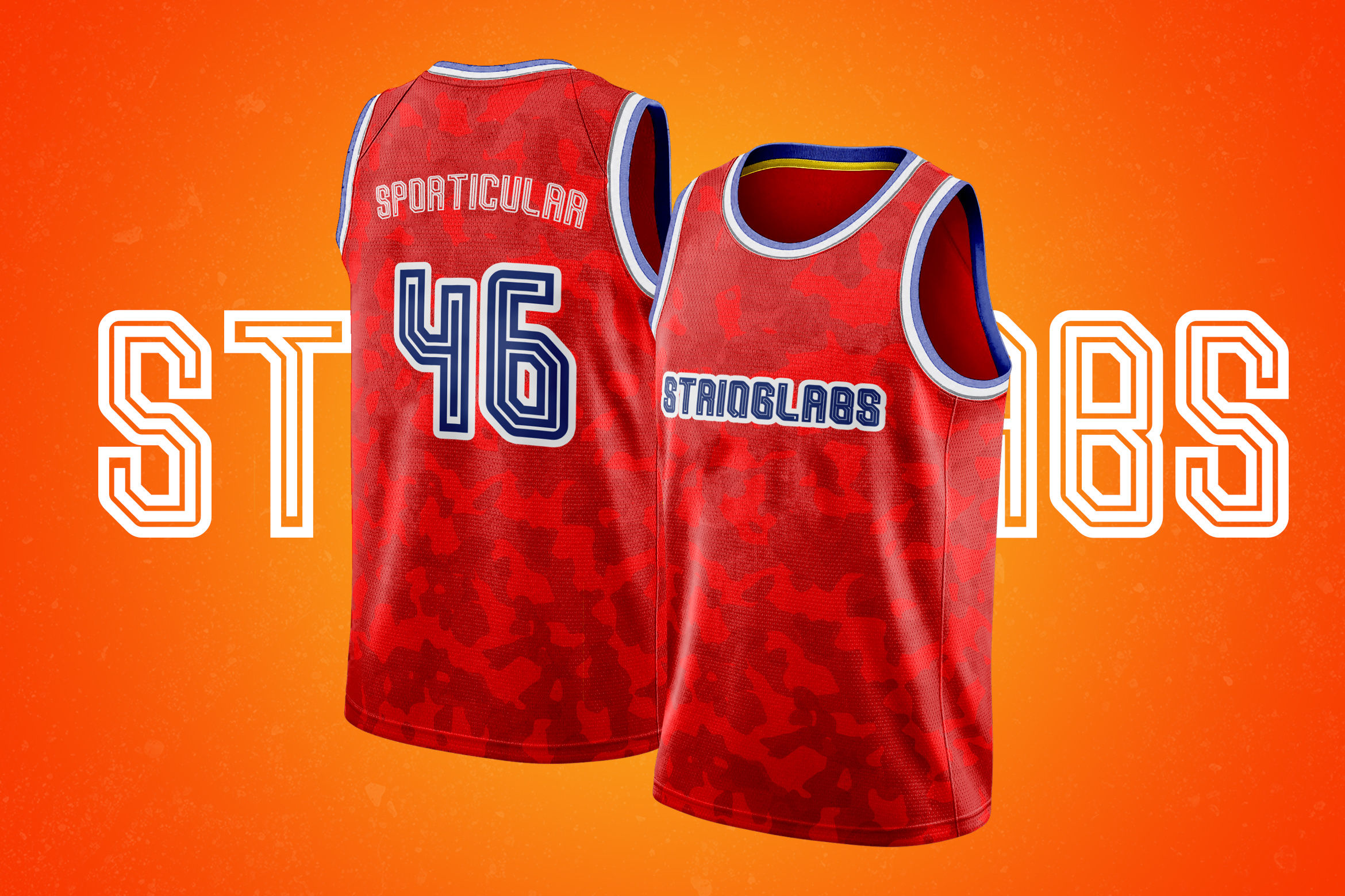
Sporticular Sporty Display Font has a classic jersey-inspired personality with decorative inline details. It feels connected to varsity, teamwear, and traditional sports graphics, making it a strong choice for retro athletic designs, school team branding, and sports event posters.
The font is especially useful when you want a design to feel bold but not plain. Its internal line details add character, which can make titles and numbers more visually interesting. This makes it a good option for posters, team shirts, sports badges, and promotional graphics.
Because the design includes decorative details, Sporticular should be used with enough size and spacing. It is not ideal for long text or small captions. Instead, use it for the main team name, jersey-style numbers, or a short headline, then support it with a simpler font.
Sporticular Sporty Display Font is a display typeface in TTF format, designed by Stringlabs, and listed as free for personal use.
5. Rusdy Ibra Sporty Display Font
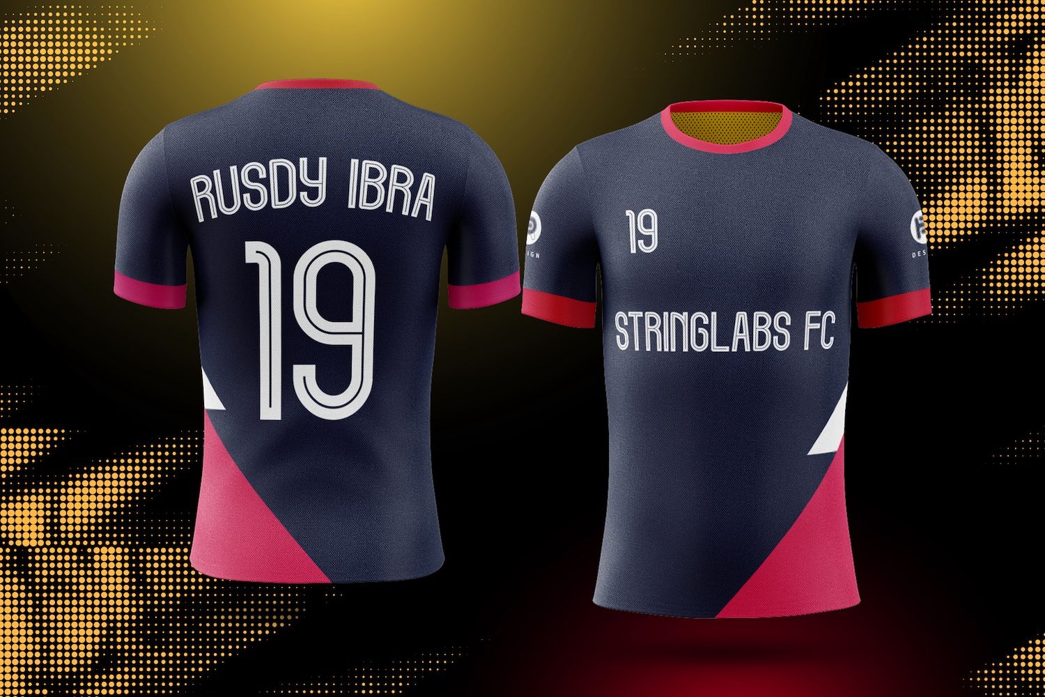
Rusdy Ibra Sporty Display Font has a slimmer athletic structure with a technical, outlined feel. Compared with heavier block jersey fonts, it can feel more refined and modern. This makes it useful for sports branding projects where you want energy without too much visual weight.
It can work well for team logos, training graphics, sports posters, and merchandise layouts. The letterforms have a strong display quality, so they are best used in short phrases rather than paragraph text.
For jersey designs, test Rusdy Ibra carefully with both player names and numbers. Its thinner structure may need strong contrast against the background, especially on fabric or printed merchandise. If the design uses dark text on a light jersey, or light text on a dark jersey, the font can feel clean and athletic.
Rusdy Ibra Sporty Display Font is a display typeface in TTF format, designed by Stringlabs, and listed as free for personal use.
6. Pixel Sport Sporty Display Font
Pixel Sport Sporty Display Font combines sporty lettering with a digital, geometric character. It is a good option for esports teams, gaming tournaments, modern athletic branding, and bold sports posters.
The font has a strong uppercase presence, which makes it useful for team names and competitive graphics. It can also work for jersey-inspired numbers where the design needs to feel sharp, modern, or tech-influenced.
Pixel Sport is best used in display situations where its distinctive shape can stand out. It may be too stylized for long text, but it can be effective for names, numbers, badges, and hero titles. If you are designing for esports, school competitions, or digital sports content, this font can help create a more contemporary identity.
Pixel Sport Sporty Display Font is a display typeface in TTF format, designed by Stringlabs, and listed as free for personal use.
7. Budi Mose Sporty Display Font
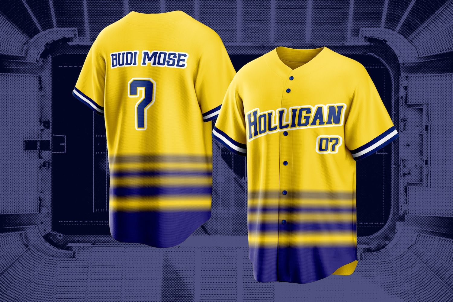
Budi Mose Sporty Display Font has a bold, compact sports style that feels suitable for uniforms, team names, and athletic branding. Its letterforms are strong and direct, making it useful when you want a jersey font with immediate visual impact.
This font can work well for team logos, player name layouts, sports merchandise, and event graphics. It has enough personality to feel athletic, while still keeping a practical display structure.
For number-based designs, Budi Mose is worth testing because its digits have a clear sporty appearance. When choosing jersey fonts, always check whether numbers such as 3, 5, 6, 8, and 9 are easy to distinguish. These digits can become confusing in overly decorative fonts, especially from a distance.
Budi Mose Sporty Display Font is a display typeface in TTF format, designed by Stringlabs, and listed as free for personal use.
8. Cyber Sport Sporty Font
Cyber Sport Sporty Font has a futuristic athletic style with angular, high-energy letterforms. It is a strong choice for modern sports graphics, esports branding, team posters, and bold merchandise designs.
The font feels especially useful for designs that need a competitive or tech-inspired edge. It can make team names look fast, sharp, and intense. The numbers also carry a strong sporty personality, which makes the font suitable for jersey-style layouts and player number graphics.
Because Cyber Sport has a distinctive shape, it works best when used as the main visual font. Avoid combining it with several other decorative fonts in the same design. A cleaner sans serif pairing will help the layout feel more professional and easier to read.
Cyber Sport Sporty Font is a display typeface in TTF format, designed by Stringlabs, and listed as free for personal use.
How to Choose the Right Jersey Font
Start by thinking about the team identity. A school basketball team may need a bold varsity-style font. An esports team may need something sharper and more futuristic. A local football club may need a strong blocky style that works well on uniforms, banners, and merchandise.
Next, test the font with real content. Do not only type a sample alphabet. Try the actual team name, player names, and numbers you plan to use. Some fonts look excellent with short words but become harder to read with longer names. Others look strong in uppercase but weaker in lowercase.
Number readability should be one of your biggest priorities. For uniforms, numbers must be clear at a distance. Avoid fonts where important digits look too similar. If 6 and 8, 3 and 5, or 1 and 7 are difficult to tell apart, the font may not be the best choice for player jerseys.
Also consider production. A font that looks good on screen may behave differently when printed, embroidered, cut in vinyl, or placed on fabric. Thin decorative lines may disappear at smaller sizes. Tight spacing may make names harder to read. Before printing, create mockups and test the font at real sizes.
Pairing Jersey Fonts with Simple Sans Serif Fonts
Jersey fonts already have a lot of personality, so they usually pair best with simple supporting typefaces. Use the jersey font for the team name, player number, logo title, or main headline. Then use a clean sans serif font for smaller details such as event dates, website text, sponsor names, descriptions, and contact information.
Avoid using too many bold sports fonts in one design. If the team name, player name, slogan, and event details all use different decorative fonts, the design can quickly feel crowded. A better approach is to choose one strong jersey font and let it lead the design.
You can also explore more display fonts if you need bold headline options, or browse the jersey font style category for more sports-focused choices.
Font License Reminder
The fonts in this list are provided as free for personal use based on the supplied font data. That means you should not assume they are safe for commercial projects, paid client work, printed merchandise, uniforms for sale, or brand identity work without checking the license first.
Before using any font commercially, visit the font page and review the author’s license terms. If needed, contact the designer or purchase the correct license. This is especially important for sports merchandise, team uniforms, posters, apparel, and logo work.
For more guidance, read the guide on personal use vs commercial use font licenses. You may also find it helpful to review how to preview fonts before downloading so you can test uppercase letters, lowercase letters, numbers, and symbols before choosing a final typeface.
FAQ About Jersey Fonts
What are jersey fonts best used for?
Jersey fonts are best used for sports team names, player numbers, uniform designs, athletic logos, tournament posters, school team graphics, and merchandise. They are usually designed for display use, so they work better for short text than long paragraphs.
Why are numbers so important in jersey font selection?
Numbers are central to sports uniforms. A font may look stylish, but if the numbers are hard to read from a distance, it can fail in practical use. Always test digits before using a font for jerseys, rosters, scoreboard graphics, or player merchandise.
Can I use free jersey fonts for coammercial merchandise?
Not automatically. Many free fonts are free only for personal use. The fonts in this article are listed as free for personal use, so you should check each font page and the author’s license terms before using them for commercial projects, printed products, or merchandise.
Should I use uppercase or lowercase for sports team designs?
Uppercase is often the strongest choice for team names because it feels bold and athletic. However, lowercase can be useful for secondary graphics, social posts, or modern branding. Test both uppercase and lowercase before choosing a font.
What should I pair with a jersey font?
Pair a jersey font with a clean sans serif font. Let the jersey font handle the main visual impact, then use the sans serif for smaller details. This keeps the design balanced and readable.
Conclusion
The best jersey fonts combine bold personality with practical readability. For sports team designs, the right font should make names feel strong, numbers easy to recognize, and the overall identity more athletic and memorable.
Virgiano, Carlitos, Bugar Sport, Sporticular, Rusdy Ibra, Pixel Sport, Budi Mose, and Cyber Sport each offer a different take on sporty display typography. Some feel more classic and varsity-inspired, while others feel modern, technical, or decorative. The best choice depends on your team identity, design purpose, and production needs.
Before choosing a final font, test the actual team name, player names, and numbers. Check uppercase, lowercase, symbols, and readability at different sizes. Most importantly, review the license carefully before using any font in commercial work or printed merchandise.