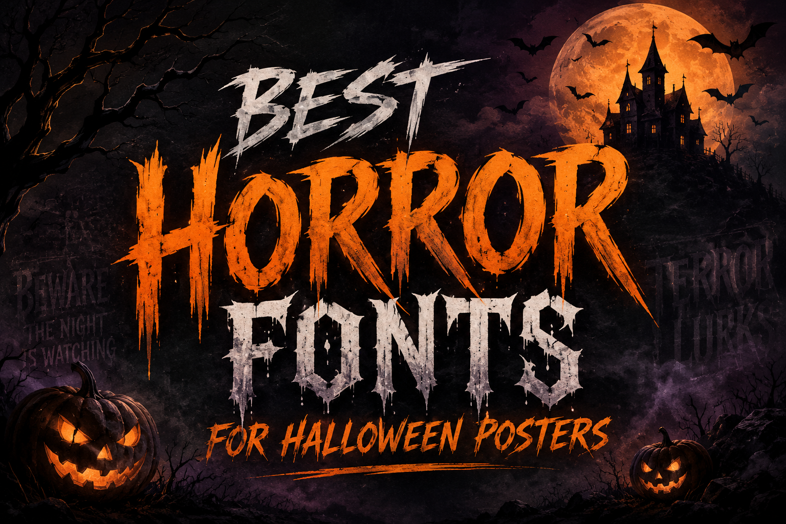
Halloween design is all about atmosphere. A good poster, flyer, thumbnail, or event graphic should tell people what kind of experience to expect before they read the details. Is it a haunted house? A scary movie night? A horror game stream? A pumpkin festival with a playful spooky theme? The right typeface can set that mood instantly.
That is why horror fonts are so useful for seasonal design. They can feel creepy, scratched, gothic, dripping, handmade, theatrical, or chaotic. But the best horror font is not always the scariest-looking one. For posters and promotional graphics, the font still needs to be readable at a glance, especially for the main headline, date, venue, price, and call to action.
Below is a curated selection of horror-friendly fonts for Halloween posters and dark visual projects. Some are intense and dramatic, while others are more playful or vintage. Use them for headlines, titles, logos, thumbnails, haunted house flyers, horror game titles, and event designs—but always check the license on each font page before using a font for business, client, or commercial work.
What Makes a Font Work for Horror Design?
A horror font usually creates tension through shape. Jagged edges, rough brush strokes, uneven baselines, dripping forms, distorted letters, gothic details, and exaggerated shadows can all make a design feel more mysterious or frightening.
For Halloween posters, mood matters, but clarity matters too. A font may look excellent in one or two words, yet become difficult to read in a long headline. Before choosing a typeface, preview it with the exact words you plan to use. Check uppercase, lowercase, numbers, punctuation, and symbols. Posters often need dates, ticket prices, times, addresses, and social media handles, so a font that only looks good in alphabet samples may not be practical for the full design.
Decorative horror fonts are usually strongest as display fonts. Use them for the title or short headline, then pair them with a simpler sans serif or serif for body text, event details, and descriptions.
Best Horror Fonts to Try
1. Provesa
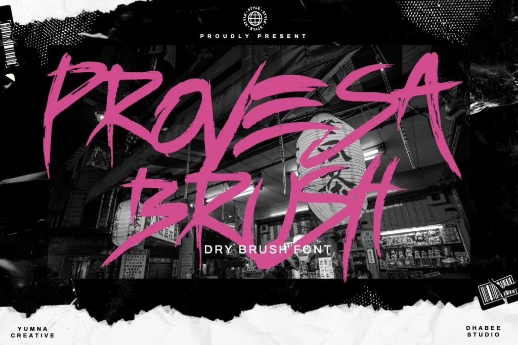
Provesa is a fast, scratchy brush font with a raw handwritten feel. Its sharp strokes and loose rhythm make it suitable for posters that need an aggressive, chaotic, or underground horror mood. It can work well for haunted house names, slasher-style titles, spooky social graphics, and dramatic Halloween headlines.
The font has strong personality, but its messy brush movement means readability depends heavily on size and spacing. It is better for short phrases than long blocks of text. Use it when you want energy and tension, but avoid making your headline too small.
License: Free for personal use. Designer: Dhabee. Formats: OTF, TTF.
2. Wranger
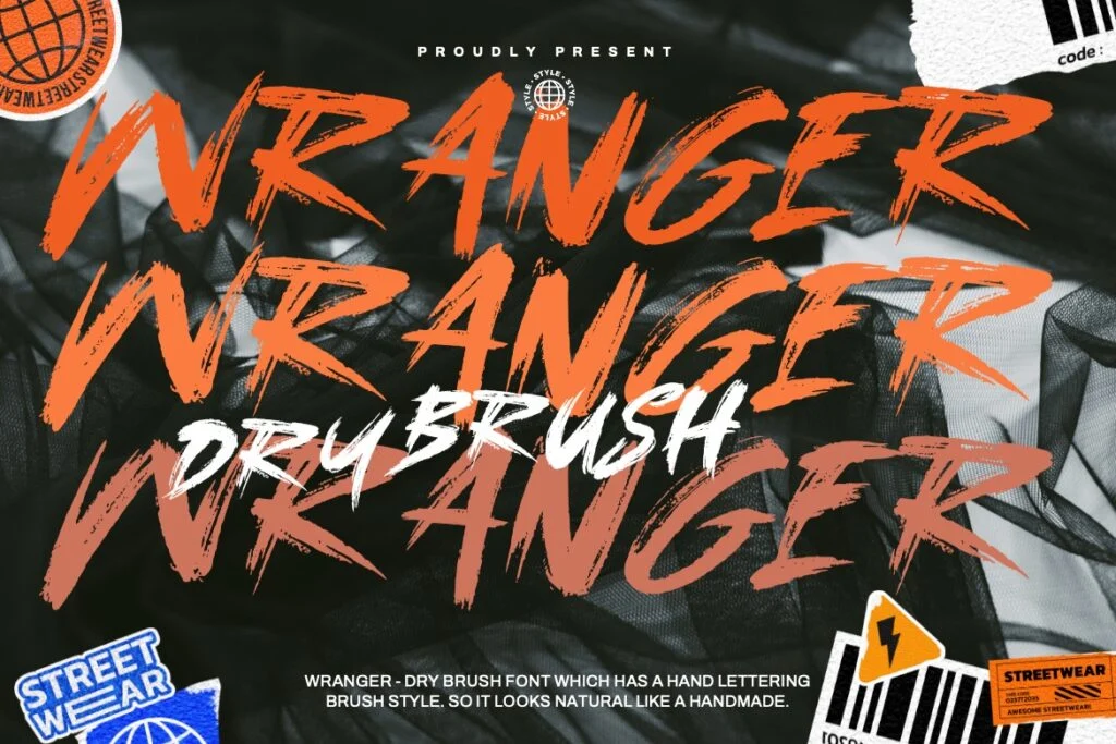
Wranger has a bold brush style with rough, distressed edges. Compared with thinner scratch fonts, it feels more forceful and easier to notice from a distance. This makes it a strong option for Halloween posters, dark music events, horror thumbnails, and bold seasonal promotions.
Its uppercase letters are especially useful for loud headlines. The texture adds danger and movement without completely sacrificing readability. Still, because the style is highly expressive, it is best used for one main title or short supporting line rather than paragraphs.
License: Free for personal use. Designer: Dhabee. Formats: OTF, TTF.
3. Trade Winds
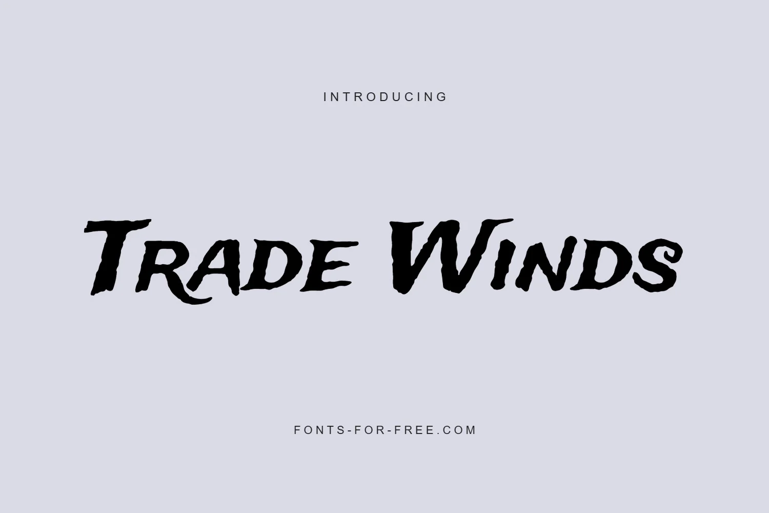
Trade Winds is a display font with a dramatic, adventurous personality. It has a hand-cut feeling, with angled strokes that can fit spooky posters, pirate-themed Halloween events, mystery nights, or vintage horror graphics. It is not as bloody or extreme as some horror fonts, which makes it useful when you want something dark but still approachable.
Readability is one of its strengths. The letters are stylized, but the overall forms remain clear enough for poster headlines and event names. Trade Winds is a good choice when you want a horror-adjacent display font that feels bold without becoming too difficult to read.
License: Public domain / OFL. Designer: Sideshow. Format: TTF.
4. Fontdiner Swanky
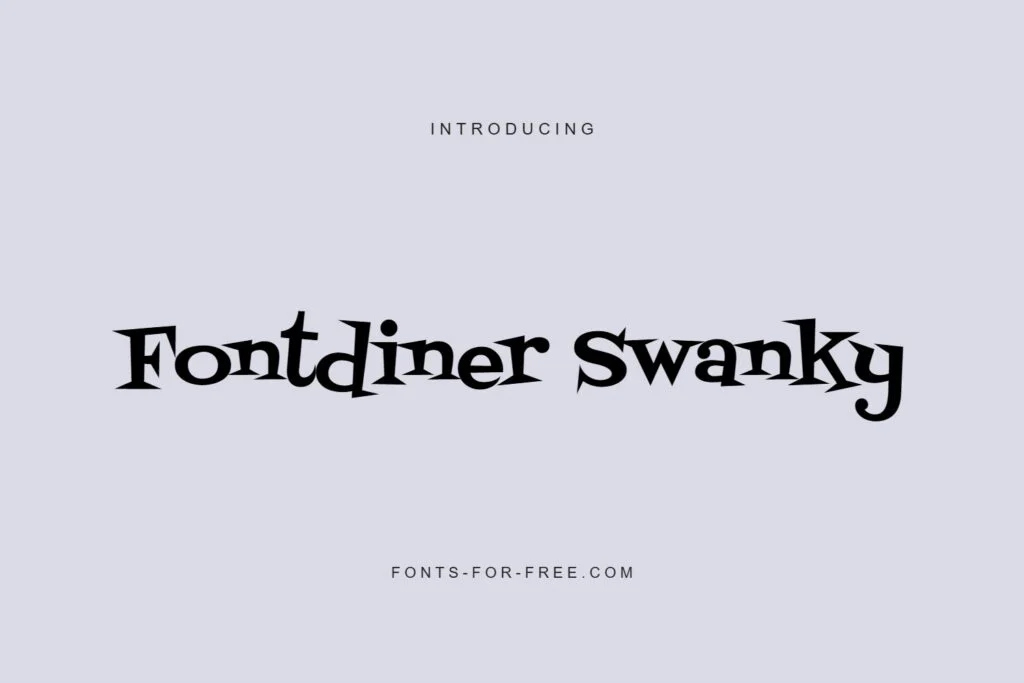
Fontdiner Swanky brings a retro, quirky, slightly spooky mood. It has vintage diner and poster-style charm, but the unusual letter shapes give it a mysterious theatrical quality. This makes it suitable for Halloween parties, retro horror nights, costume events, and family-friendly spooky graphics.
It works best when the project needs personality rather than pure fear. The uppercase style can feel decorative and bold, while the lowercase text has a playful vintage rhythm. Because of its distinctive shapes, test your exact headline before committing, especially if the title includes unusual names or longer words.
License: Free for commercial use; special note: Apache 2.0. Designer: Font Diner. Format: TTF.
5. Rubik Wet Paint
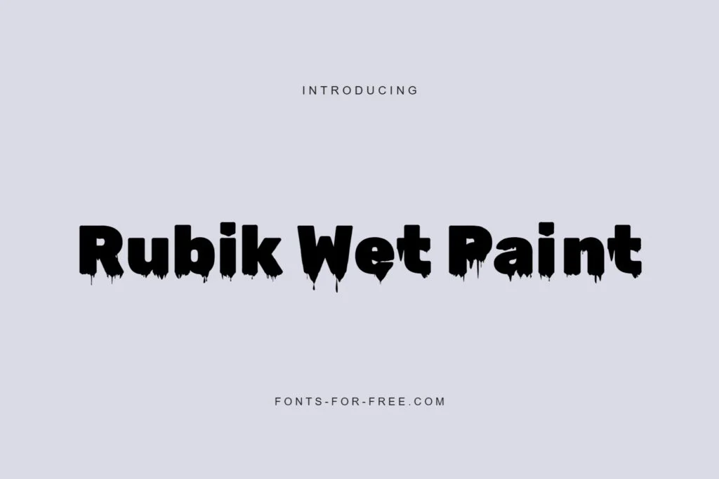
Rubik Wet Paint is heavy, dark, and dripping. It instantly suggests horror, slime, shadows, wet paint, or something unsettling. This makes it a strong choice for haunted house posters, scary thumbnails, horror game titles, and Halloween graphics that need a dramatic visual punch.
Because the letters are thick and high-impact, Rubik Wet Paint can hold attention quickly. It is more readable than many highly distressed horror fonts, especially in large sizes, but the dripping details can become crowded when used too small. Keep it for big headlines and pair it with a clean font for supporting information.
License: Public domain / OFL. Designer: Nan. Format: TTF.
6. Eater
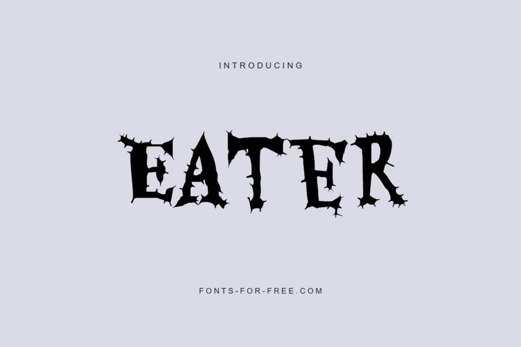
Eater has a jagged, gothic horror look with sharp decorative edges. It feels theatrical, spooky, and slightly monstrous, making it useful for haunted events, scary movie posters, Halloween menus, dark party flyers, and themed YouTube thumbnails.
The font has strong Halloween character while keeping many letterforms recognizable. It works particularly well in uppercase headlines. For readability, avoid using it for long event descriptions or small-print details. Let it act as the main mood-setter, then use a simpler font for the practical information.
License: Public domain / OFL. Designer: Typomondo. Format: TTF.
7. Frijole
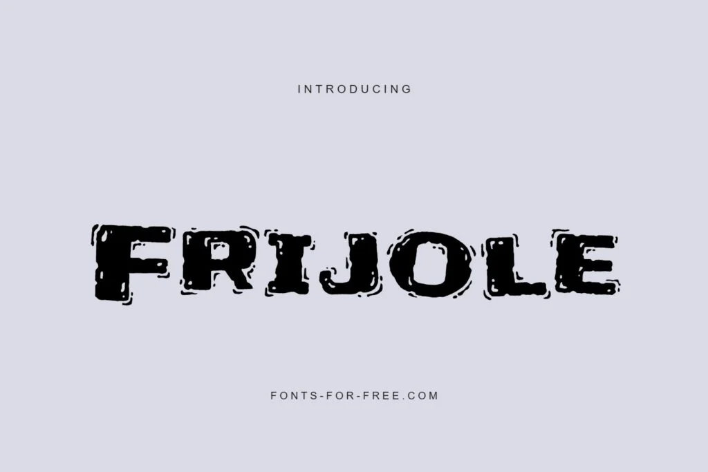
Frijole is rough, bold, and textured, with a distressed display style that fits spooky posters and dark seasonal designs. It has a stamped or weathered quality, which can be useful for haunted attractions, horror-themed promotions, and bold graphic titles.
The font is more structured than many scratch-style horror fonts, so it can remain readable in large headline settings. However, the distressed texture can blur at smaller sizes. Use it for poster titles, short labels, and dramatic section headings rather than dense text.
License: Public domain / OFL. Designer: Sideshow. Format: TTF.
8. Nosifer
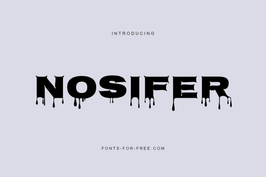
Nosifer is one of the most intense options in this collection. It has heavy block letters with dripping details, making it feel dark, scary, and suitable for direct horror themes. It is a natural fit for haunted house flyers, horror game titles, gore-inspired graphics, scary thumbnails, and dramatic Halloween posters.
Its impact is very strong, but it needs space. The dripping forms and heavy weight can make long phrases harder to read, especially if the text is compressed or placed over a busy background. Use Nosifer when you want the design to feel unmistakably horror-focused, and keep the wording short.
License: Public domain / OFL. Designer: Typomondo. Format: TTF.
9. Sedgwick Ave Display
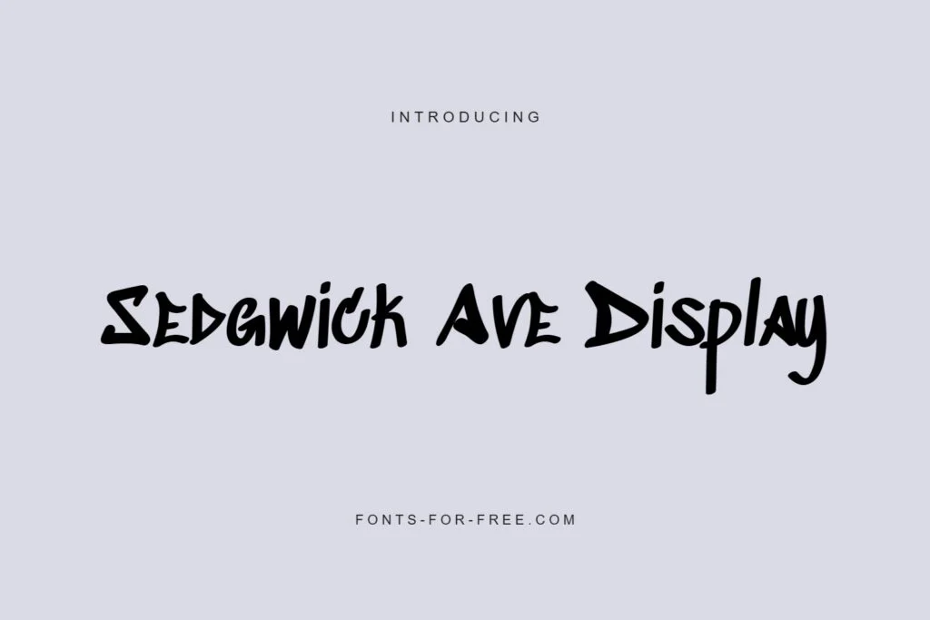
Sedgwick Ave Display has a loose, handwritten display style. It is not a traditional blood-drip horror font, but it can work well for eerie, urban, mysterious, or handmade Halloween designs. Its irregular strokes give it a restless energy that suits posters, thumbnails, alternative event flyers, and spooky social media graphics.
The readability is generally friendly for short phrases, especially compared with more extreme horror fonts. It can be a good choice when you want something spooky but not too heavy. Try it for casual Halloween events, creative titles, or designs that need a hand-drawn edge.
License: Public domain / OFL. Designer: Pedro Vergani. Format: TTF.
10. Buztery
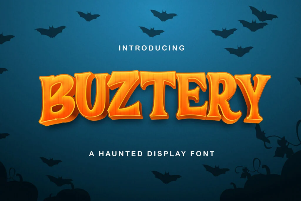
Buztery has a bold decorative display style with vintage horror flavor. It feels theatrical, poster-like, and slightly gothic, which makes it useful for Halloween posters, spooky invitations, haunted event titles, and seasonal branding.
Its letterforms are fairly strong and readable in large sizes, especially for uppercase headlines. The personality is distinctive without being overly chaotic, so it can be a practical choice for designs that need to look spooky but still polished. Use it for titles and short promotional phrases, not long paragraphs.
License: Free for personal use. Designer: Stringlabs. Format: TTF.
11. Butcherman
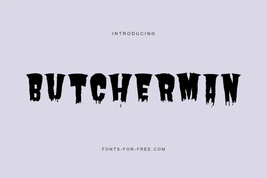
Butcherman is built for horror. It has bold, uneven forms with sharp, dripping, cut-out details that feel dramatic and unsettling. It is especially suitable for horror posters, haunted house titles, scary event flyers, and designs that need an obvious Halloween identity.
Because the style is highly decorative, Butcherman works best when given plenty of space. It can make a strong title, but it may become harder to read if the phrase is long or if the background is busy. Use it confidently for short horror headlines, then balance it with a simple font for the rest of the layout.
License: Public domain / OFL. Designer: Typomondo. Format: TTF.
12. Kablammo
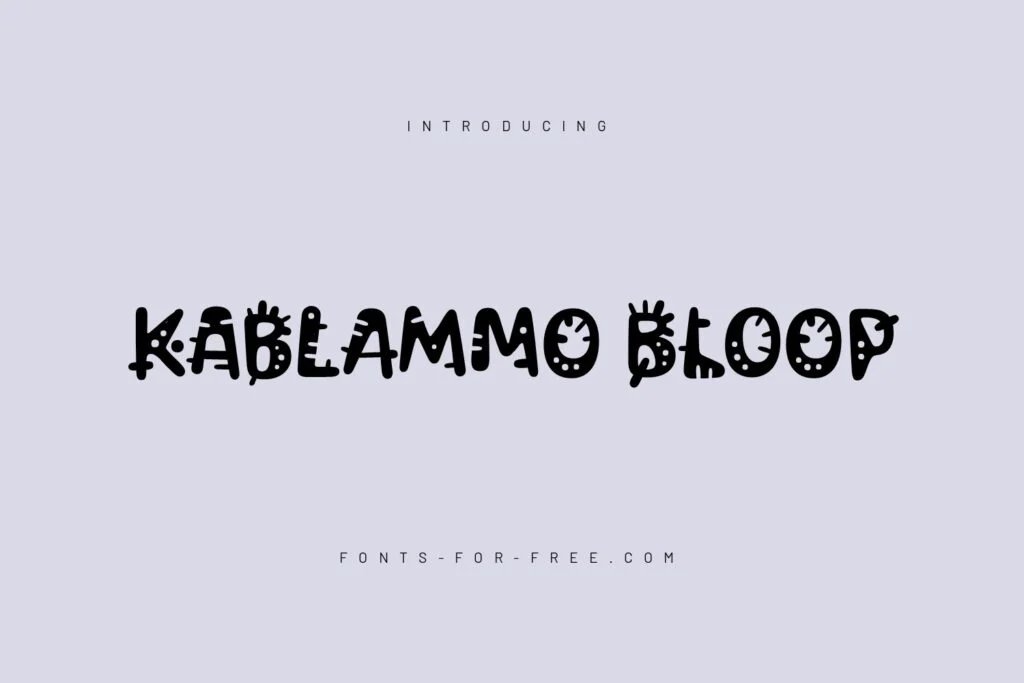
Kablammo is playful, strange, and highly decorative. It has a quirky experimental look that can fit cartoon horror, monster-themed graphics, children’s Halloween events, spooky stickers, and unusual game titles. It is less terrifying than fonts like Nosifer or Butcherman, but it has a weird, energetic personality.
Readability depends on how it is used. Its decorative forms can be fun in large titles, but they may distract from important event details. Use Kablammo when the design needs a spooky-but-playful tone rather than a serious horror atmosphere.
License: Public domain / OFL. Designer: Vectro Type Foundry. Format: TTF.
13. Tavelins
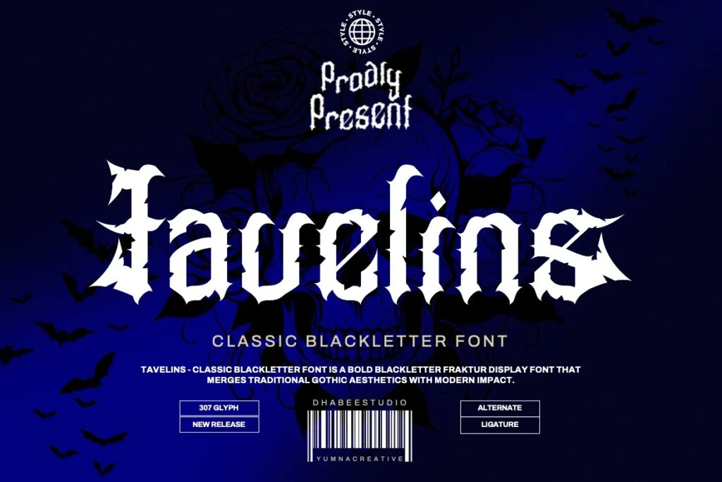
Tavelins is a blackletter-style font with a dark medieval feel. It can work well for gothic Halloween posters, vampire themes, haunted castle events, fantasy horror titles, and dramatic seasonal graphics. Its sharp vertical rhythm gives it an old-world mood that feels mysterious and formal.
As with many blackletter fonts, readability is the main thing to watch. It can look excellent in one or two words, but longer phrases may become harder for casual readers. Use it for short titles, names, or gothic accents. For more fonts in this direction, browse the blackletter font category.
License: Free for personal use. Designer: Dhabee. Formats: OTF, TTF.
How to Choose the Right Horror Font
Start with the mood of the project. A haunted house poster may need a darker, more aggressive font like Nosifer, Butcherman, or Rubik Wet Paint. A retro Halloween party may work better with Fontdiner Swanky or Trade Winds. A spooky but casual social graphic may benefit from Sedgwick Ave Display or Kablammo.
Next, test readability. Type your actual headline, event date, venue name, and any numbers you need. Many horror fonts look great with sample text but become difficult when used for real event information. Check uppercase and lowercase letters, especially if your design includes names, addresses, or mixed-case titles.
Finally, limit the number of decorative fonts. One horror font is usually enough. If you combine too many scary typefaces, the design can feel messy and less professional. Let the horror font carry the mood, then use a clean supporting font for body copy.
Font License Reminder
Before using any font in a commercial poster, client project, product graphic, event promotion, YouTube thumbnail, or business design, review the license on the font page and the author’s license terms. “Free download” does not always mean free for commercial use.
Some fonts in this list are marked as free for personal use, which usually means you should not use them for business or client work unless you obtain the proper permission or license. Others are listed with public domain, OFL, Apache 2.0, or commercial-use permissions, but it is still smart to confirm the terms before publishing or printing.
Related Font Categories and Guides
For more options, browse horror fonts, display fonts, and blackletter fonts.
You may also find these guides helpful: Best Display Fonts for Poster Headlines and How to Preview Fonts Before Downloading.
FAQ
What are horror fonts best used for?
Horror fonts are best used for poster headlines, Halloween titles, haunted house flyers, horror game logos, dark thumbnails, and spooky event graphics. They are designed to create mood quickly, so they work best in large, short text.
Can I use horror fonts for body text?
Usually, no. Highly decorative horror fonts can be difficult to read in long paragraphs. Use them for headlines, then choose a simpler font for descriptions, schedules, addresses, and other details.
What should I check before downloading a horror font?
Preview the font with your own words. Check uppercase, lowercase, numbers, punctuation, and symbols. Also review the license carefully, especially if you plan to use the font for a commercial project.
Which horror font is best for Halloween posters?
It depends on the mood. Nosifer, Butcherman, and Rubik Wet Paint are strong for intense horror. Fontdiner Swanky and Trade Winds are better for vintage or playful Halloween designs. Tavelins works well for gothic themes.
Are free horror fonts always free for commercial use?
No. Some free fonts are only free for personal use. Always check the font page and the author’s license terms before using a font in business, client, printed, or monetized projects.
Conclusion
The best horror fonts do more than look scary. They help your design communicate a clear mood while keeping the most important message readable. For Halloween posters, haunted house flyers, horror thumbnails, and dark event promotions, choose a font that matches the tone of the project, test it with your real text, and use it mainly for headlines.
A strong horror font can make your design feel dramatic, mysterious, playful, or terrifying—but the final choice should still be practical. Check the characters you need, avoid overcrowding the layout, and always review the license before using a font commercially.