Choosing a font is easier when you can see how it behaves before adding it to your project. A font may look exciting in a title, but it might become difficult to read in lowercase, unclear in numbers, or unsuitable for your brand once you test it with your own words. That is why learning how to preview fonts before downloading is an important step for designers, small business owners, content creators, and beginners who simply want their text to look right.
A good preview helps you move beyond first impressions. Instead of choosing a font only because the sample looks attractive, you can check whether it works for your actual headline, logo text, poster title, thumbnail, menu, jersey number, or social media graphic. This guide explains what to look for before downloading a font and how to compare options with more confidence.
Why Previewing a Font Before Downloading Matters
Fonts are not just decorative assets. They affect readability, tone, and the overall feeling of a design. A bold display font can make a poster feel energetic, while a serif font can add a more classic or editorial mood. A handwritten font may feel personal and expressive, but it may not be the best choice for long paragraphs or small labels.
Previewing helps you answer practical questions before you download:
Does the font match the mood of the project? Is it readable at the size you plan to use? Do the numbers look good? Are the lowercase letters easy to recognize? Does the font include the characters you need? Is the license suitable for your intended use?
These checks are especially helpful when comparing different categories, such as display fonts, handwritten fonts, and serif fonts. Each category can be useful, but each one has different strengths.
Step-by-Step: How to Preview Fonts Before Downloading
1. Test the Font With Your Own Words
The most important preview step is to type your actual project text. A font that looks good with a sample phrase may feel completely different with your brand name, event title, product label, or YouTube thumbnail text.
For example, a short wordmark may need strong personality, while a poster headline may need clear spacing and impact from a distance. If your project uses a specific phrase, test that phrase before downloading. This helps you catch awkward letter combinations, unusual spacing, or letters that do not match the style you expected.
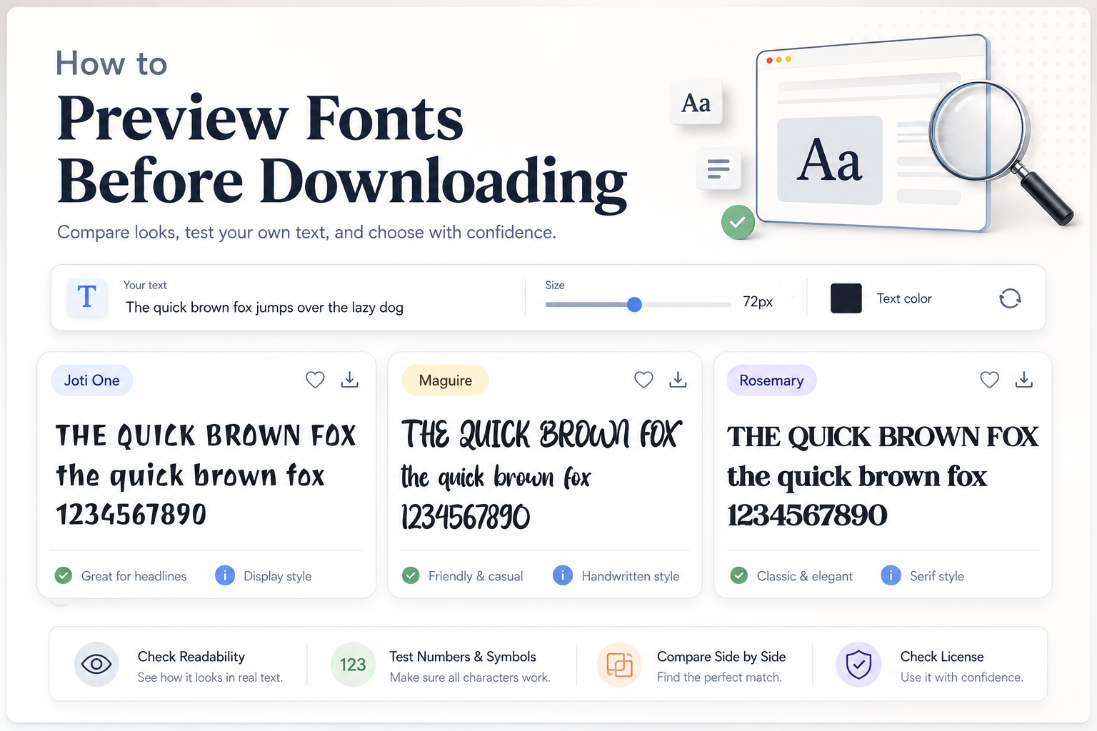
Joti One, for instance, has a playful display character with bold, irregular letter shapes. It can work well when you want a fun, expressive title rather than a formal or minimal look. Maguire has a handwritten style that feels casual and energetic, making it more suitable for creative headings or personal-looking designs. Rosemary, as a serif font, has a stronger classic presence and can suit elegant titles, editorial-style graphics, or decorative headline layouts.
2. Check Uppercase and Lowercase Letters
Many users only look at uppercase letters because they are often used in font samples. That can be misleading. A font may have strong uppercase forms but very different lowercase shapes. If your project includes sentence case, names, captions, or product descriptions, lowercase letters matter just as much.
Uppercase letters are useful for posters, logos, badges, and strong headlines. Lowercase letters are often better for natural reading. When previewing, test both versions of your text:
Try your headline in all caps. Then test it in title case or sentence case. Look at letters such as a, e, g, r, s, and t because they often reveal how readable and distinctive the typeface really is.
This is especially important with decorative or handwritten fonts. Maguire may bring a lively, hand-drawn feeling to a short phrase, but you should still check whether the lowercase letters remain clear for your intended size. Joti One can be bold and memorable, but its playful shapes should be tested carefully if the text needs to be read quickly.
3. Review Numbers and Symbols
Numbers are easy to forget until the final design stage. If you are making jersey graphics, event posters, price labels, date announcements, thumbnails, invitations, menus, or social media promos, numbers can be just as important as letters.
Before downloading, type numbers such as 1234567890 and check their weight, spacing, and style. Some fonts have numbers that look narrow, wide, playful, formal, or highly decorative. That can either strengthen your design or create a mismatch.
Symbols also matter. Check punctuation, ampersands, currency symbols, slashes, and other characters your project may need. A beautiful font is less useful if it does not include the glyphs required for your layout.
4. Test Readability at Large and Small Sizes
A font can be readable as a large headline but difficult to use in small text. Decorative fonts, display fonts, and expressive handwritten fonts are usually better for short text. They are not always suitable for paragraphs, descriptions, disclaimers, or small interface labels.
When previewing, reduce the size and see what happens. Are the letters still clear? Does the spacing feel too tight? Do similar letters become hard to distinguish? Can someone understand the text quickly?
As a general rule, use highly decorative fonts for headlines, logos, covers, thumbnails, posters, and short phrases. For longer reading, choose a simpler companion font. This is where font pairing potential becomes important. A strong display font may work best when paired with a clean sans serif or readable serif for supporting text.
What to Check Before Choosing a Font
Glyph Coverage and Character Variety
A glyph showcase can help you see more than a basic alphabet sample. It lets you check whether the font includes uppercase letters, lowercase letters, numbers, punctuation, accented characters, and special symbols.
This is useful if you are designing for names, multilingual text, product packaging, or business materials. Even if a font looks perfect stylistically, missing characters can slow down your workflow later.
Font Pairing Potential
A font should not be judged alone if your final design uses multiple text styles. Many projects need one font for the headline and another for body text, subtitles, captions, or buttons.
For example, Joti One may pair well with a simpler supporting font because its display personality is already strong. Maguire may work best when used sparingly with a clean, neutral font nearby. Rosemary can create a more classic or bold editorial tone, but it still needs a readable partner if the layout includes longer text.
When comparing fonts, use the same sample text across several options. This makes it easier to notice differences in mood, spacing, and readability.
License Information
Before using any font in a real project, review the license information on the font page and the author’s license terms. This is especially important for business, client, product, advertising, or commercial work.
Joti One is listed with a Public domain / OFL license, but you should still review the font page and included license details before use. Maguire and Rosemary are listed as free for personal use, so do not assume they can be used commercially without checking the author’s terms or obtaining the proper permission.
For a deeper explanation, read this guide to personal use vs commercial use font licenses. License mistakes can create problems later, especially when a design is used for branding, merchandise, ads, templates, or client work.
Common Mistakes to Avoid
One common mistake is downloading a font before testing the actual project text. A font may look great in a standard sample but not work with your specific words.
Another mistake is only checking uppercase letters. Lowercase letters can change the entire feel and readability of a design.
Many people also forget to test numbers. This matters for sports designs, prices, dates, rankings, posters, event graphics, and thumbnails.
Avoid using decorative fonts for long paragraphs. A font with strong personality is often better as an accent, not as the main reading font.
Finally, never ignore the license. A font being downloadable does not automatically mean it is allowed for commercial use.
FAQ
How do I preview fonts before downloading?
Type your own text into the font preview area, then check uppercase letters, lowercase letters, numbers, symbols, and readability at different sizes before deciding.
Should I test the same text across several fonts?
Yes. Comparing several fonts with the same sample text makes it easier to judge style, spacing, readability, and font pairing potential.
Are decorative fonts good for paragraphs?
Usually not. Decorative, display, and handwritten fonts are often best for short headlines, logos, posters, or accents. For long paragraphs, choose a more readable text font.
Why should I check the license before downloading?
The license explains how you are allowed to use the font. Some fonts are free for personal use only, while commercial use may require permission or a separate license.
Conclusion
Previewing a font before downloading helps you choose with more confidence. Test your own words, compare uppercase and lowercase letters, check numbers and symbols, review glyph coverage, and make sure the font remains readable at the size you need. If the font will be used in a business or client project, always review the license information before using it commercially.
A careful preview takes only a few moments, but it can prevent poor font choices, readability issues, and licensing problems later.