Choosing the right font can instantly change how a technology brand feels. A clean sans serif may communicate simplicity and trust, while a sharp futuristic display font can make a brand look advanced, experimental, digital, and bold. For tech branding, the challenge is not only finding a font that looks modern. The font also needs to support the brand personality, stay readable, and work well across logos, websites, app graphics, pitch decks, thumbnails, and digital campaigns.
Futuristic fonts are especially useful for brands in artificial intelligence, SaaS, gaming, cybersecurity, blockchain, robotics, apps, and digital products. They often use geometric shapes, angular cuts, extended letterforms, stencil-like details, sci-fi curves, or condensed proportions to create a sense of innovation. When used carefully, they can help a brand feel more confident, forward-looking, and memorable.
Below are some futuristic fonts to consider for tech branding projects, especially when you need strong display typography for logos, headlines, hero sections, and promotional visuals.
What Makes a Font Look Futuristic?
A font usually feels futuristic because of its structure. Many futuristic fonts avoid traditional serif details and instead use geometric construction, squared corners, modular strokes, sharp cuts, or rounded digital shapes. Some look inspired by sci-fi interfaces, gaming logos, motorsport graphics, or technology hardware branding.
In branding, these details matter because typography becomes part of the visual identity. A font with angular edges can make a brand feel powerful and technical. A rounded futuristic font can feel friendlier, more accessible, and startup-oriented. A tall condensed font can make a logo feel sleek and fast, while a heavy display font can make a gaming or AI product feel bold and energetic.
However, futuristic fonts are usually best for display use. They work well in logos, short brand names, large headlines, app splash screens, YouTube thumbnails, posters, packaging, and hero banners. For long paragraphs, interface descriptions, blog content, or dashboard text, a simple sans serif font is usually a better choice.
Best Futuristic Fonts to Try
1. Super Punch
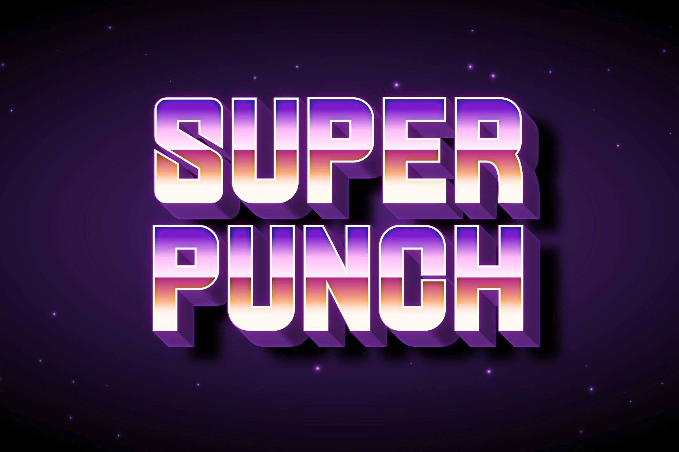
Super Punch is a bold display font with a strong futuristic personality. Its letterforms feel compact, heavy, and technical, making it a good option for brands that want to look energetic and modern without becoming too decorative.
This font can work well for tech logos, esports visuals, product names, digital posters, and bold headline treatments. The uppercase letters have a strong presence, which makes them suitable for short words and brand marks that need impact. The numbers also have a consistent digital character, which can be useful for tech campaigns, edition labels, or product version graphics.
For readability, Super Punch is better at larger sizes. It can still be clear in short phrases, but its display style may become less comfortable in small interface text. Use it for brand names, hero headlines, badges, and promotional graphics, then pair it with a clean sans serif for body copy and UI content.
License note: Super Punch is listed as free for personal use. Always review the font page and the author’s license terms before using it in commercial branding or client projects.
2. Superbolt
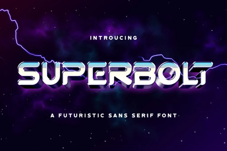
Superbolt has a rounded, tech-inspired display style that feels futuristic but slightly more playful than sharp sci-fi fonts. Its smooth, chunky shapes give it a friendly digital look, making it useful for startups, app logos, gaming brands, and creative tech products.
This font is a strong choice when you want a futuristic identity that does not feel too cold or corporate. It can suit brands related to mobile apps, entertainment platforms, gaming communities, AI tools for creators, or digital products aimed at younger audiences. The rounded construction helps it feel approachable, while the unusual letter details keep it visually distinctive.
Superbolt is best for logos, short headlines, stickers, social media graphics, and product title designs. Because of its stylized shapes, it should be tested carefully with the exact brand name before final use. Some letters may look more decorative than others, so preview uppercase, lowercase, numbers, and symbols to make sure the full identity feels balanced.
The provided license is free for personal use, so commercial projects require extra checking before use.
3. Phoenix Gaming
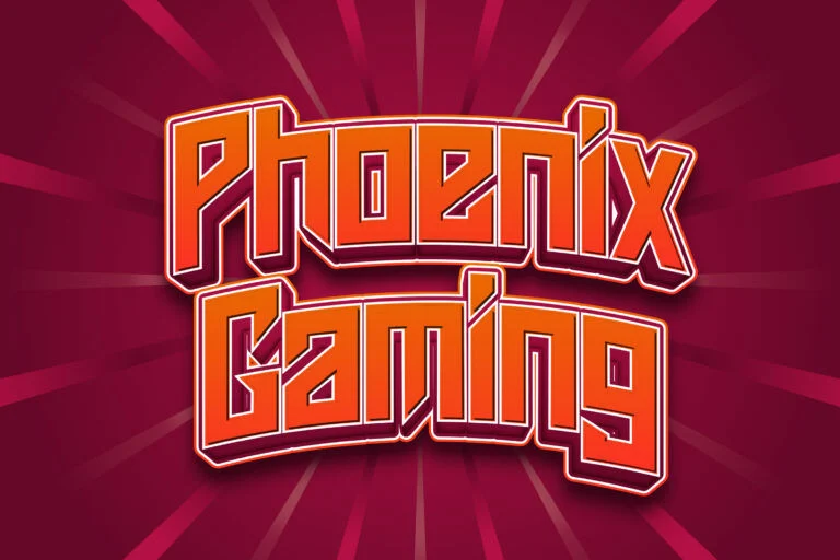
Phoenix Gaming brings a sharper gaming-style energy into the futuristic category. Its letterforms feel angular, competitive, and digital, which makes it especially suitable for esports logos, gaming channels, tech events, streaming graphics, and action-oriented brand identities.
Compared with softer futuristic fonts, Phoenix Gaming feels more aggressive and performance-driven. That makes it useful for brands that want to communicate speed, power, challenge, or high-energy innovation. It may also work for cyber-themed posters, tournament branding, and product visuals for gaming accessories or entertainment apps.
For readability, Phoenix Gaming performs best in large display settings. It is not the kind of font to use for long descriptions or small navigation labels. Use it where visual impact matters most, such as logo marks, header graphics, team names, and campaign titles. If the brand needs a more professional SaaS or enterprise tone, pair it with a neutral sans serif to balance the aggressive style.
Phoenix Gaming is listed as free for personal use. Check the license terms before using it in commercial logos, merchandise, or client branding.
4. Technocra
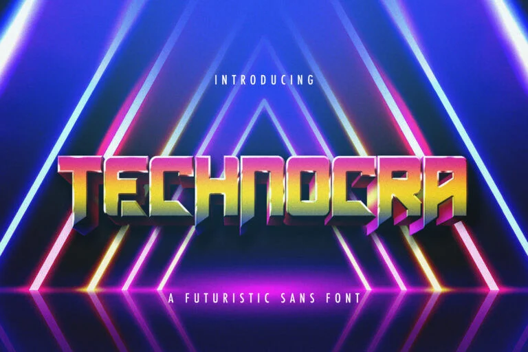
Technocra has a bold, angular, and highly technical look. It feels suitable for brands that want a stronger sci-fi identity, especially in areas like AI products, cybersecurity visuals, robotics, futuristic gaming, and digital innovation campaigns.
The font’s sharp cuts and blocky rhythm give it a strong mechanical character. This makes it useful for logos and headlines that need to feel advanced, engineered, or powerful. Technocra can be a good fit for a tech conference title, a futuristic YouTube thumbnail, a gaming product logo, or a digital poster with a cyber-inspired theme.
Because the font has a very distinctive shape, it should be used with control. It can quickly dominate a design, so it is better as the main display typeface rather than one of many decorative fonts. Use it for the core brand wordmark or key headline, then keep supporting typography simple.
Technocra is listed as free for personal use. For commercial branding, review the font page and license details carefully before using it.
5. Fun Games Futuristic Display Font
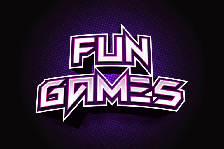
Fun Games Futuristic Display Font is a sharp and energetic display font with a strong futuristic gaming feel. Its angular cuts create a fast, dynamic appearance, making it suitable for designs that need motion, excitement, and digital attitude.
This font can work well for gaming logos, tech product campaigns, esports banners, app launch graphics, and bold social media visuals. It has enough personality to make a headline stand out, especially when used in uppercase or short phrases. The style feels modern and expressive, so it can help a brand appear bold and memorable.
However, because it is highly stylized, it is not ideal for long text or small UI labels. Use it for display moments: logo concepts, hero headlines, posters, thumbnails, and packaging-style graphics. Before choosing it for a brand identity, test the exact brand name and important numbers to make sure the letter shapes remain clear.
This font is provided in OTF and TTF formats and is listed as free for personal use. Check the license before using it commercially.
6. Asteroid Font Futuristic Sans Serif
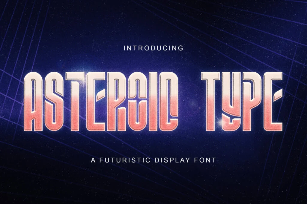
Asteroid Font Futuristic Sans Serif has a tall, condensed, and futuristic sans serif style. Compared with heavier gaming fonts, Asteroid feels more minimal and structured, which can make it useful for sleek technology branding, app visuals, digital posters, and modern product headlines.
Its narrow proportions give it a compact, space-efficient look. That can be helpful for brand names, UI-themed graphics, event titles, and futuristic editorial layouts. It may also work well for AI products, sci-fi-inspired landing pages, and tech-related social media designs where you want a modern atmosphere without using an overly heavy font.
Readability is generally stronger in large sizes and short text blocks. Because condensed fonts can become harder to read when too small, test it carefully before using it for interface text or secondary information. It is better suited to titles, labels, and display typography than long paragraphs.
Asteroid is listed as free for personal use. Always check the font page and license terms before using it in a commercial project.
7. Super Guardian Futuristic Sans Font
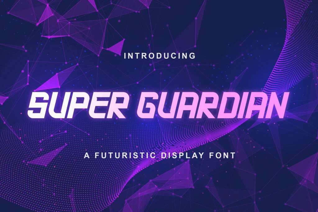
Super Guardian Futuristic Sans Font has a sporty, slanted, futuristic display style. It feels fast, active, and confident, which makes it a good option for brands connected to gaming, digital performance, technology events, sports-tech visuals, or energetic startup campaigns.
The italic-like movement gives the font a sense of speed. This can help a logo or headline feel more dynamic, especially when combined with bold colors, gradients, neon effects, or dark technology-inspired layouts. It is a strong candidate for short brand names, esports graphics, product badges, and bold campaign headlines.
Because Super Guardian has a strong angle and display personality, it works best when used sparingly. Avoid using it for paragraphs or dense text. A clean sans serif partner can help keep the overall brand system readable and professional.
The license is listed as free for personal use. For commercial logos, client projects, digital products, or paid campaigns, review the license terms before use.
8. Armygedon Modern Display Font
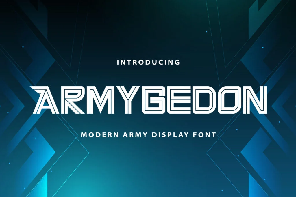
Armygedon Modern Display Font has a modern outlined display style with a futuristic edge. Its structure feels technical and decorative, making it useful for sci-fi posters, gaming visuals, tech event graphics, futuristic packaging, and experimental brand concepts.
Unlike heavier filled fonts, Armygedon has a more open and outlined appearance. This can create a lighter, more graphic look, especially for titles, badges, and large visual compositions. It may work well when a brand wants something futuristic but not overly dense.
Because outlined fonts depend heavily on size and contrast, Armygedon should be tested carefully before use. It can look stylish at large sizes, but small text may lose clarity. Use it for display graphics rather than body content, and make sure there is enough contrast between the text and background.
Armygedon is listed as free for personal use. Check the font page and author license before using it in any commercial brand identity.
How to Choose the Right Futuristic Font
The best futuristic font is not always the most decorative one. For branding, the right choice depends on personality, readability, and consistency.
Start by asking what the brand should communicate. A cybersecurity brand may need a font that feels sharp, controlled, and technical. A gaming brand may benefit from something more aggressive and energetic. An AI writing tool might need a futuristic font that feels modern but still friendly and accessible. A SaaS platform may only need a subtle futuristic headline font, supported by a clean sans serif for the rest of the system.
Always preview the font with the actual brand name before downloading or finalizing it. Some futuristic fonts look great in sample text but behave differently when used with a real name, especially if the word includes repeated letters, narrow characters, or unusual combinations. Also test uppercase, lowercase, numbers, punctuation, and symbols, especially if the brand will use product codes, pricing, version numbers, or app interface labels.
Readability should be tested at multiple sizes. A font that looks excellent on a hero banner may not work in a mobile app icon or small social media thumbnail. If the letters become confusing at smaller sizes, keep the font for large display use only.
Pairing Futuristic Fonts with Clean Sans Serif Fonts
A good font pairing can make a futuristic brand feel polished instead of chaotic. In most cases, use one futuristic display font as the main identity font, then pair it with a clean sans serif for body text, navigation, captions, product descriptions, and interface content.
This creates contrast and balance. The futuristic font gives the brand its memorable visual voice, while the simple sans serif keeps the design readable and professional. Avoid mixing several futuristic fonts in one identity system, because the result can look busy and inconsistent.
For example, a bold futuristic font can be used for the logo and hero headline, while a neutral sans serif can handle website paragraphs, app UI, pricing pages, and documentation. This approach is especially useful for SaaS websites and AI products, where clarity is just as important as visual personality.
Font License Reminder for Branding Projects
Licensing is especially important in branding. A font used in a logo, app interface, website, packaging, advertising campaign, or merchandise may require a commercial license, even if the font is free to download for personal use.
All fonts in this list are provided with license information as free for personal use. That means you should not assume commercial use is allowed. Before using any of these fonts for a client project, startup brand, paid product, or business identity, check the font page and review the author’s license terms. When in doubt, contact the designer or purchase the correct commercial license.
This step protects both the designer and the brand. It is much better to confirm the license before launch than to redesign a logo later because the font usage was not permitted.
Related Font Categories and Guides
For more display-style typefaces, you can explore the Display font category. Display fonts are useful for logos, posters, headlines, thumbnails, packaging, and visual identity work where personality matters more than long-form readability.
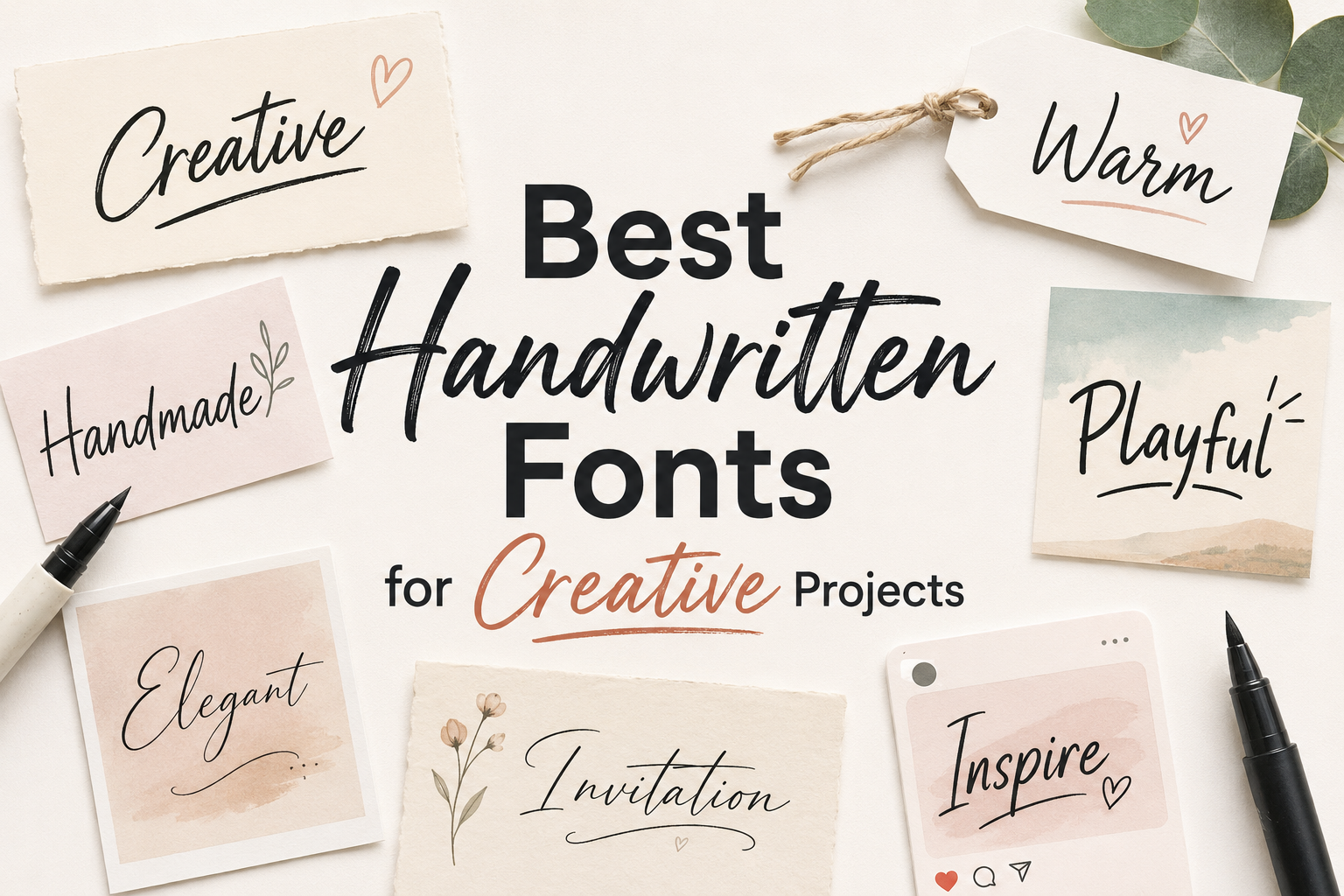
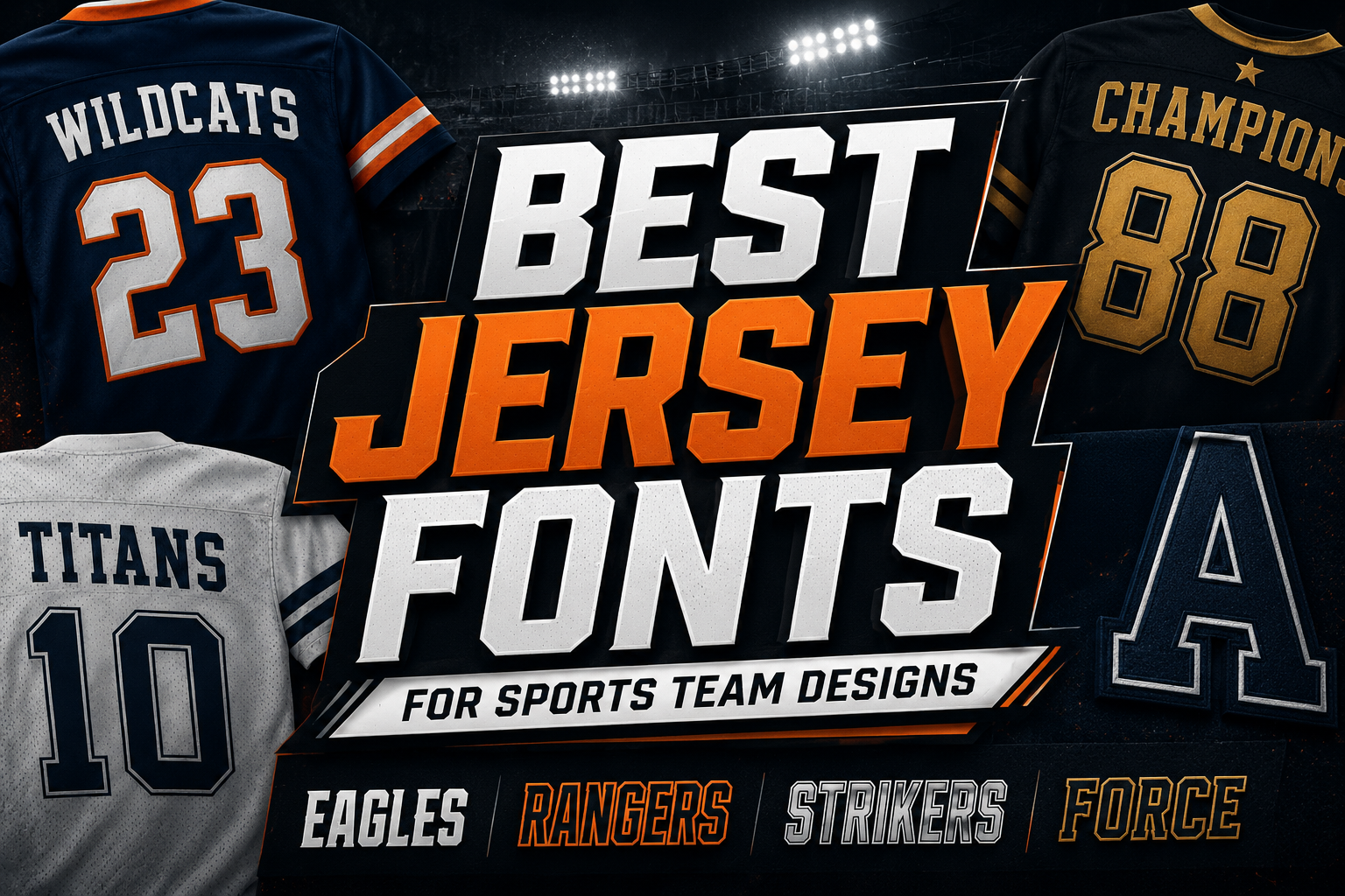
You may also like this related guide: Best Jersey Fonts for Sports Team Designs. While jersey fonts have a different purpose, they can be useful inspiration for bold, energetic, and logo-focused typography.
FAQ
Are futuristic fonts good for logos?
Yes, futuristic fonts can work very well for logos, especially for tech startups, AI products, gaming brands, SaaS tools, robotics companies, and digital platforms. The key is to test the font with the actual brand name and make sure it remains readable.
Can I use futuristic fonts for body text?
Usually, no. Most futuristic fonts are display fonts, so they are better for logos, headlines, hero sections, and promotional graphics. For paragraphs and interface text, use a clean sans serif font that is easier to read.
What should I check before downloading a futuristic font?
Preview the font with your own words, test uppercase and lowercase letters, check numbers and symbols, and try it at different sizes. You should also review the license terms before using the font in a commercial project.
How many futuristic fonts should I use in one brand identity?
In most cases, one futuristic display font is enough. Pair it with a simple sans serif font for supporting text. Using too many decorative fonts can make the brand look inconsistent and harder to read.
Are these fonts free for commercial use?
The fonts listed here are marked as free for personal use. That does not automatically mean commercial use is allowed. Always check each font page and the author’s license terms before using a font for logos, client work, business branding, or paid products.
Conclusion
Futuristic fonts can give a tech brand a strong visual identity when they are chosen with purpose. They can make a logo feel more advanced, make a headline more memorable, and help digital products stand out in a crowded market. But the best results come from balance: use futuristic fonts for high-impact display text, keep supporting typography clean, and always test readability before making a final decision.
Whether you are designing for an AI startup, a SaaS website, a gaming brand, an app logo, or a digital marketing campaign, choose a font that matches the brand personality instead of simply following a trend. A futuristic font should not only look modern. It should help the brand feel clear, distinctive, and ready for the future.