A design can have beautiful colors, strong images, and a clean layout, but if the text looks confusing, people will not know where to look first. Font hierarchy solves that problem. It gives your text a clear order so readers can quickly understand what matters most, what supports the main message, and what they should read next.
Font hierarchy is not only about making a title big. It is about using size, weight, spacing, contrast, font pairing, and consistency to guide attention. You can use it in posters, websites, social media graphics, presentations, packaging, brand layouts, and almost any design that includes text.
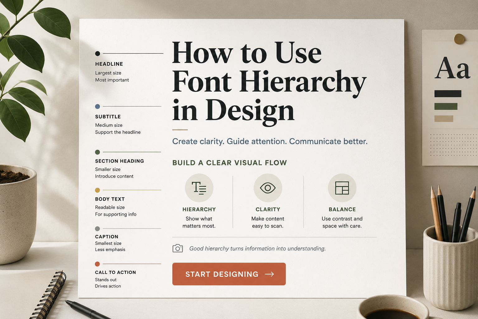
What Is Font Hierarchy in Design?
Font hierarchy is the visual order of text in a design. It tells the reader which words are most important and which information is secondary.
A simple hierarchy may look like this:
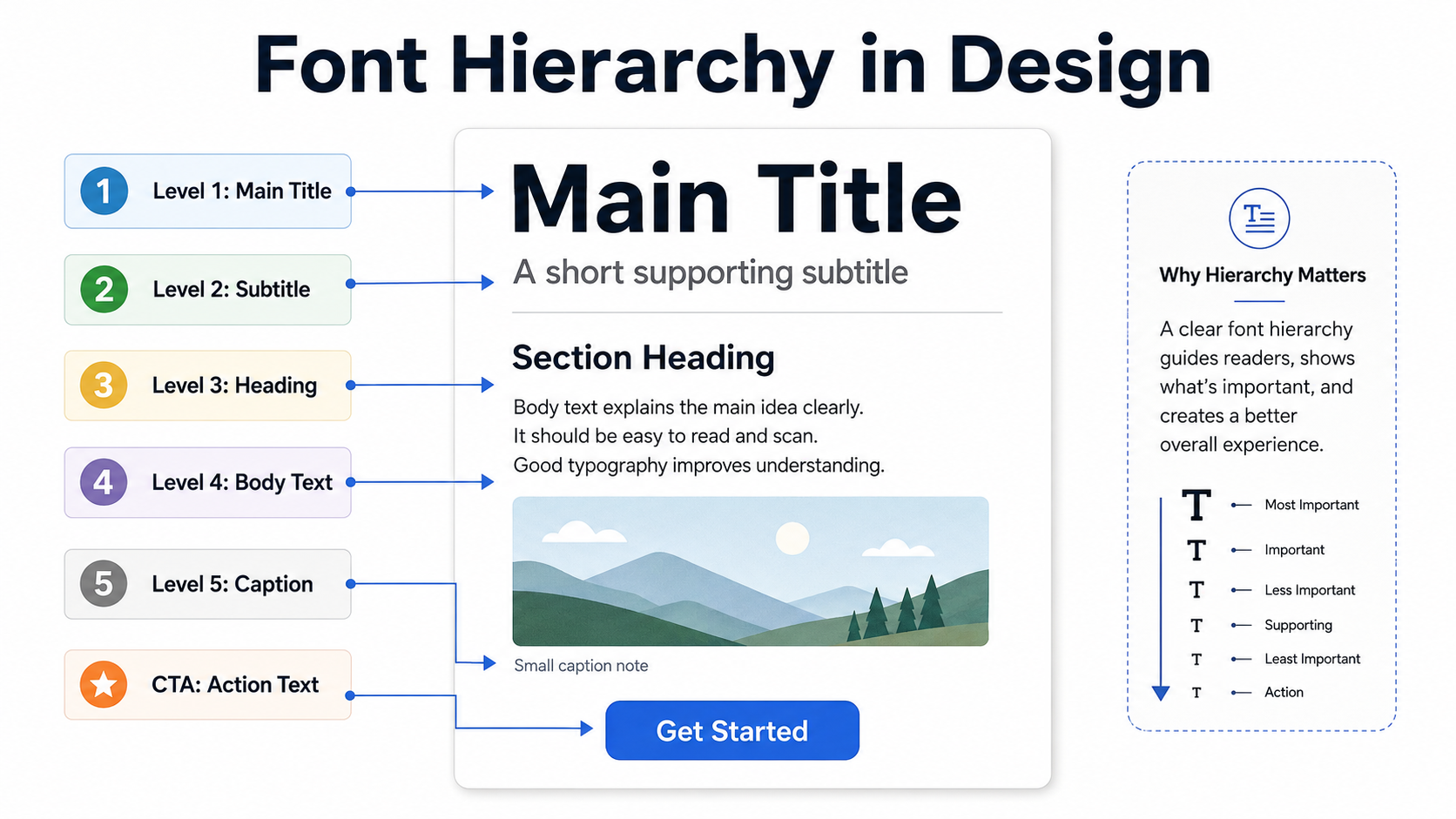
Title
The title is the first thing people notice. It usually carries the main message, such as a campaign name, poster headline, website hero text, or presentation slide title.
Subtitle
The subtitle supports the title. It gives extra context without competing with the main headline.
Heading
Headings divide content into sections. They help readers scan the design and understand the structure.
Body Text
Body text carries the main explanation. It should be easy to read and comfortable at smaller sizes.
Caption
Captions are smaller pieces of supporting information, often used under images, charts, product details, or notes.
Call-to-Action
A call-to-action tells the reader what to do next, such as “Download Now,” “Learn More,” “Join Today,” or “View Collection.” It should stand out clearly, but it does not always need to be the largest text.
Why Font Hierarchy Matters
Most people do not read every word immediately. They scan first. A good hierarchy helps them decide where to start.
On a poster, the reader may only have a few seconds to notice the event name, date, and location. On a website, visitors need to understand the page before they scroll. On a social media graphic, the main message must be clear even on a small phone screen.
Without hierarchy, all text competes for attention. The result feels flat, crowded, or difficult to read. With hierarchy, the design feels more organized. Readers can move naturally from the main message to the supporting details.
Start With the Message, Not the Font
Before choosing sizes or styles, decide what the reader needs to notice first.
For example, in a sale poster, the discount might be the most important element. In a wedding invitation, the couple’s names may need the strongest visual focus. In a website hero section, the main benefit or headline should usually lead.
Ask yourself:
- What should people read first?
- What information supports that message?
- What details can be smaller?
- What action should the reader take?
Once the order is clear, the font choices become easier.
Use Font Size to Create Clear Contrast
Size is the most direct way to build hierarchy. Larger text usually feels more important. Smaller text feels more supportive.
A poster might use a large title, a medium subtitle, and smaller event details. A presentation slide might use a strong title at the top, short supporting text below, and small labels for charts or notes.
The mistake is making the size difference too weak. If your title is only slightly larger than the body text, the design may still feel unclear. Give each level enough visual separation.
A practical starting point:
- Use the largest size for the main title.
- Use a noticeably smaller size for the subtitle.
- Use comfortable, readable sizing for body text.
- Use small text only for short captions or notes.
Avoid making body text too large just to fill space. Large body text can make a layout feel heavy and reduce the impact of the title.
Use Font Weight With Purpose
Font weight means how thick or thin the letters appear. Bold text attracts attention. Regular text feels calmer. Light text can look elegant, but it may become hard to read at small sizes.
Use bold weight for headings, important labels, or short emphasis. Use regular weight for longer reading. This creates a natural contrast without needing too many fonts.
The key is restraint. If every line is bold, nothing feels important. Bold should create emphasis, not noise.
For example, in a website section:
- A bold heading can introduce the topic.
- A regular paragraph can explain it.
- A bold button label can guide the next action.
That simple difference already creates hierarchy.
Control Spacing, Line Height, and Margins
Spacing is often what separates a polished design from a crowded one. Font hierarchy is not only built through the letters themselves. It also depends on the space around them.
Line height affects how easy body text is to read. If lines are too close together, the paragraph feels cramped. If they are too far apart, the text feels disconnected.
Margins also help show relationships. A heading should usually sit closer to the paragraph it introduces than to the previous section. This tells readers which text belongs together.
In a presentation slide, adding more space between the title and body text can make the title feel stronger. In a social media graphic, giving the main phrase enough breathing room can make it easier to read at small sizes.
Do not treat empty space as wasted space. Good spacing makes hierarchy visible.
Pair Fonts Carefully
Font pairing can support hierarchy when the fonts have different roles. For example, a display font may work well for a short poster title, while a clean sans serif or serif font may work better for body text.
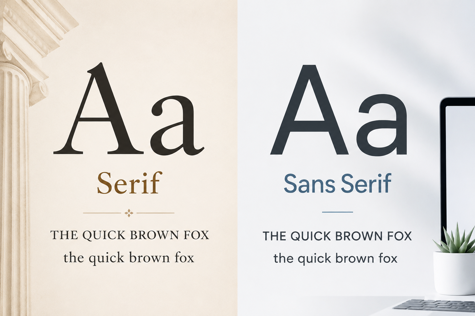
You can explore categories such as Display Fonts for expressive headlines, Sans Serif Fonts for clean modern layouts, Serif Fonts for classic or editorial designs, and Script Fonts for decorative accents.
The problem starts when too many fonts appear in one design. Mixing several decorative styles can make the layout look messy. For most beginner projects, one or two font families are enough.
A safe approach is:
- Use one font for headings and titles.
- Use one readable font for body text.
- Use decorative fonts only for short text.
If you use a script or display font, avoid using it for long paragraphs. Decorative fonts can add personality, but they often lose readability in body text.
For logo-related typography decisions, this guide may also be useful: How to Choose a Font for a Logo.
Use Color and Contrast Without Hurting Readability
Color can help hierarchy, but it should not do all the work. If the only difference between a heading and body text is color, the design may still feel weak. Some users may also have difficulty seeing low-contrast color combinations.
Use color to support structure, not replace it. A title can be larger and bolder, then color can add extra emphasis. A call-to-action button can use color contrast, but the label still needs to be readable.
Avoid pale text on light backgrounds or dark text on busy images. If text sits over a photo, consider adding a subtle overlay, shape, or cleaner background area behind it.
Readability matters more than style. A beautiful color combination is not successful if people cannot read the words.
Keep Hierarchy Consistent Across the Design
Consistency is what makes a design feel professional. Once you choose a style for headings, body text, captions, and buttons, keep using those styles throughout the layout.
This is especially important for websites, presentations, brand documents, and multi-page designs. If one slide uses a large bold heading and the next slide uses a small thin heading, the audience may feel that the structure is random.
Consistency does not mean every page must look identical. It means the same type of information should receive the same visual treatment.
For example:
- All section headings can use the same size and weight.
- All captions can use the same smaller style.
- All buttons can use the same text treatment.
- All body text can use the same readable font and spacing.
This helps readers learn the system quickly.
Practical Examples of Font Hierarchy
Poster Design
A poster usually needs strong visual impact. The event name or main message should be the largest text. The date, location, and short details should be smaller but still easy to find.
A common mistake is making the event description compete with the title. Keep the main title dominant, then use spacing and smaller text to organize the details.
Website Hero Section
A website hero section often needs a clear headline, short supporting sentence, and button. The headline should explain the main value quickly. The supporting text should be shorter and quieter. The button should stand out enough to be noticed after the message is understood.
Do not make the subtitle almost as large as the headline. It can weaken the visual order.
Social Media Graphic
Social media graphics are often viewed on small screens. Use fewer words, stronger size contrast, and enough spacing. A short phrase in a large size usually works better than a crowded paragraph.
Before publishing, check the design on mobile. Text that looks fine on a desktop can become too small on a phone.
Presentation Slide
Slides need fast scanning. A title should tell the audience what the slide is about. Body text should be short. Captions, chart labels, and notes should stay secondary.
Avoid filling the slide with paragraphs. If everything is large and bold, the audience may not know what to focus on.
Brand Layout
Brand layouts need consistent typography across many materials. A business card, website banner, flyer, and social post should feel connected. Using the same heading style, body font, and spacing rules helps create a recognizable identity.
What to Check Before Using or Downloading Fonts
Before choosing a font for a design, preview it with your own words. A font may look good in a sample phrase but feel different with your actual brand name, headline, or product title.
Check uppercase, lowercase, numbers, and symbols. Some fonts look strong in capital letters but weaker in lowercase. Others may have beautiful letters but limited punctuation or number styling.
Test readability at both large and small sizes. A font that works for a poster headline may not work for website body text. A clean body font may not have enough personality for a campaign title.
Also check the license on each font page and read the author’s license terms before commercial use. Do not assume that every free font is free for client work, products, branding, merchandise, or advertising.
Common Font Hierarchy Mistakes to Avoid
Using too many fonts is one of the fastest ways to weaken a design. It creates visual conflict and makes the layout harder to understand.
Another common mistake is making all text look similar. If the title, subtitle, heading, and body text share almost the same size and weight, the reader has to work harder.
Relying only on color is also risky. Size, weight, spacing, and structure should carry the hierarchy first.
Avoid decorative fonts for long reading. They can work beautifully for short titles, but they often become tiring in paragraphs.
Too much bold text is another problem. Bold should point to important information. If half the design is bold, the emphasis disappears.
Finally, do not ignore spacing. Even good font choices can feel amateur if sections are squeezed together without clear separation.
Simple Font Hierarchy Checklist
Before finishing a design, review these points:
- Can the reader identify the main message in a few seconds?
- Is the title clearly different from the subtitle and body text?
- Are headings consistent across the layout?
- Is the body text comfortable to read?
- Is bold text used only where it adds emphasis?
- Is there enough spacing between sections?
- Are decorative fonts limited to short text?
- Does the design still work on mobile or at small sizes?
- Have you checked the font license before commercial use?
FAQ
What is the easiest way to create font hierarchy?
Start with size. Make the main title clearly larger than the supporting text. Then use font weight, spacing, and contrast to strengthen the structure.
How many fonts should I use in one design?
For most beginner projects, one or two font families are enough. Use one for headings and one for body text, or use different weights from the same family.
Can color create font hierarchy?
Yes, but color should support hierarchy, not carry it alone. Use size, weight, and spacing first. Then use color to add emphasis or guide attention.
Are decorative fonts good for hierarchy?
Decorative fonts can work well for short titles, logos, or accent text. They are usually not suitable for long body text because readability can suffer.
Why does my design still look confusing even with different font sizes?
The size difference may be too small, or the spacing may not clearly separate sections. Check whether your title, subtitle, body text, and call-to-action each have a distinct role.
Final Thoughts
Font hierarchy helps readers understand a design without effort. It gives text a clear order, supports readability, and makes layouts feel more intentional.
Start with the message. Decide what should be seen first, second, and third. Then use size, weight, spacing, contrast, font pairing, and consistency to guide the reader’s eye.
Good hierarchy does not need complicated typography. It needs clear decisions. Once each text level has a purpose, the design becomes easier to scan, easier to read, and easier to trust.