Choosing between serif and sans serif fonts can change the whole feeling of a design. A logo may look established or modern. A website may feel editorial or minimal. A poster may look elegant, bold, playful, or plain depending on the typeface style you choose.
The difference may look small at first: serif fonts have small finishing strokes at the ends of letters, while sans serif fonts do not. But in real design work, that small visual detail affects mood, readability, spacing, brand personality, and how people understand your message.
This guide explains serif vs sans serif fonts in a simple, practical way. You will learn how each style looks, where it is commonly used, and how to choose the right one for logos, websites, posters, presentations, packaging, branding, and printed materials.
What Are Serif Fonts?
Serif fonts are typefaces with small strokes, feet, or decorative endings attached to the main parts of letters. These details are called serifs.
Look at letters like T, E, N, or A in a serif typeface. You will usually notice small extensions at the top, bottom, or ends of the letterforms. These details can be thin and elegant, strong and traditional, or soft and literary depending on the font.
Serif fonts are often connected with:
- Books and magazines
- Newspapers and editorials
- Luxury packaging
- Academic materials
- Formal invitations
- Traditional brand identities
That does not mean every serif font feels old-fashioned. Some serif typefaces look sharp, modern, and stylish. Others feel classic, serious, or decorative. The category is broad, so the exact mood depends on the specific font.
You can browse serif typefaces here: Serif fonts.
What Are Sans Serif Fonts?
Sans serif fonts are typefaces without serif strokes. The word “sans” means “without,” so sans serif simply means “without serifs.”
The letters usually look cleaner, simpler, and more direct. Their shapes often rely on clear lines, open spacing, and less ornamentation. Because of this, sans serif fonts are widely used in digital design, modern branding, user interfaces, posters, apps, presentations, and websites.
Sans serif fonts are often associated with:
- Clean website layouts
- Modern logos
- Tech and startup branding
- App interfaces
- Business presentations
- Minimal posters
- Product labels
A sans serif font can feel friendly, corporate, futuristic, casual, or bold depending on its weight, spacing, shape, and proportions. A rounded sans serif may feel approachable, while a narrow bold sans serif may feel strong and urban.
You can explore sans serif typefaces here: Sans serif fonts.
The Main Visual Difference
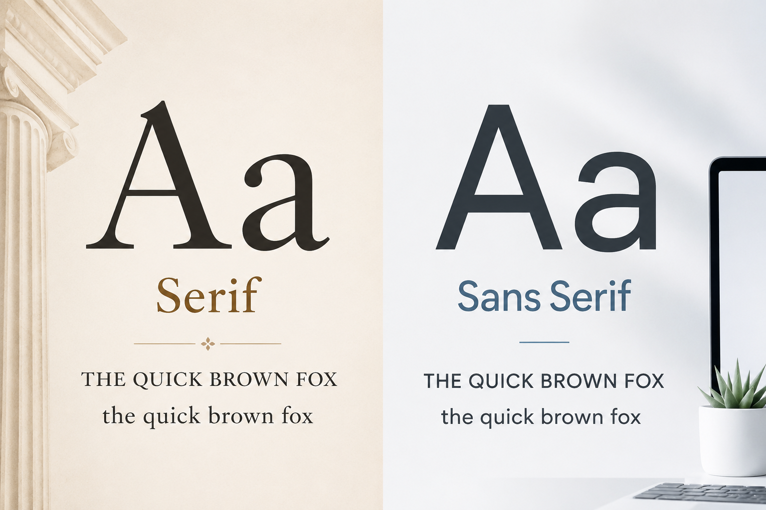
The easiest way to compare serif and sans serif fonts is to look at the endings of the letters.
A serif font has small finishing strokes. A sans serif font has cleaner endings without those extra strokes.
For example, imagine the phrase:
THE QUICK BROWN FOX
the quick brown fox
1234567890
In a serif font, the uppercase letters may feel more formal or editorial because of the small strokes at the ends. The lowercase letters may have a more traditional reading rhythm. The numbers may look more book-like or classic.
In a sans serif font, the same text may feel cleaner, more neutral, and more modern. The uppercase letters often look direct and simple. The lowercase letters may feel easier to scan on a screen, especially in menus, buttons, and short labels.
That is the core difference, but it is not the only factor. Letter spacing, stroke thickness, x-height, contrast, and font weight also affect how readable or suitable a font feels.
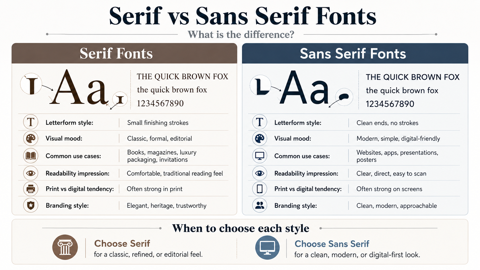
| Aspect | Serif Fonts | Sans Serif Fonts |
|---|---|---|
| Letterform style | Small finishing strokes at the ends of letters | Clean letter endings without extra strokes |
| Visual mood | Classic, formal, editorial, traditional | Modern, clean, simple, digital-friendly |
| Best use cases | Books, magazines, invitations, luxury packaging | Websites, apps, presentations, posters |
| Print use | Often works well in printed editorial layouts | Good for clean print layouts and short text |
| Digital use | Useful for headings, quotes, and editorial websites | Common for body text, menus, buttons, and interfaces |
| Branding impression | Elegant, established, trustworthy, refined | Approachable, simple, modern, direct |
| Readability | Can feel comfortable in long print text when well designed | Often easy to scan on screens when spacing and weight are clear |
| Overall feel | More classic and editorial | More clean and contemporary |
Mood: Classic vs Modern Is Only a Starting Point
A common shortcut is to say serif fonts are traditional and sans serif fonts are modern. That is partly useful, but it can also be too simple.
Serif fonts often feel classic or editorial
Serif fonts are commonly used when a design needs a sense of tradition, trust, elegance, or seriousness. A book cover, law firm logo, luxury skincare label, or formal event invitation may use a serif font because it can create a refined or established mood.
Serif fonts can work well for:
- Editorial headlines
- Printed books
- Luxury branding
- Certificates
- Formal invitations
- Historical or academic themes
- Premium packaging
However, not all serif fonts are suitable for long reading. Some decorative serif fonts look beautiful in large titles but become tiring or unclear in small body text. Always test the font at the actual size you plan to use.
Sans serif fonts often feel clean or digital-friendly
Sans serif fonts usually create a cleaner and simpler impression. They are popular for digital products because they often work well in navigation menus, buttons, mobile layouts, dashboards, and short interface text.
Sans serif fonts can work well for:
- Website body text
- App interfaces
- Modern logos
- Business decks
- Posters
- Social media graphics
- Product labels
- Startup branding
Still, sans serif does not automatically mean better. A very thin sans serif may look elegant in a large hero section but become hard to read on mobile screens. A very condensed sans serif may look bold in a poster but feel cramped in a paragraph.
Readability in Print and Digital Design
Readability is one of the biggest reasons people compare serif vs sans serif fonts. The problem is that many designers treat this as a fixed rule, when it should be tested in context.
Serif fonts in print
Serif fonts have a long history in printed books, newspapers, and magazines. In long printed text, a well-designed serif typeface can feel comfortable because the letterforms create a steady reading flow.
This is why novels, academic books, and editorial publications often use serif fonts for body text. The style can give printed pages a familiar and polished texture.
But readability still depends on the font. A high-contrast or decorative serif may not work well for small paragraphs. A serif font with generous spacing, clear lowercase letters, and balanced stroke contrast will usually perform better.
Sans serif fonts on screens
Sans serif fonts are widely used on websites and apps because their clean shapes can stay readable across different screen sizes. They often work well for menus, buttons, captions, forms, and short paragraphs.
For digital content, clarity matters more than category. A sans serif font with strong spacing and readable letter shapes may work beautifully. A thin, tightly spaced sans serif may fail on small screens.
The safest approach is simple: test your font where people will actually read it. Check desktop, mobile, large headings, small captions, numbers, symbols, and buttons before deciding.
When to Use Serif Fonts
Use serif fonts when your design needs a more refined, established, literary, or formal tone.
A serif font can be a good choice for a boutique logo, wedding invitation, printed magazine, premium product label, book cover, or personal brand that wants to feel thoughtful and elegant.
For websites, serif fonts can work especially well in article titles, editorial headers, pull quotes, and brand sections. They can also work for body text if the font is clean, readable, and properly sized.
Good situations for serif fonts include:
- A magazine-style blog layout
- A classic book cover
- A premium food or beauty brand
- A formal presentation title slide
- A historical poster
- An elegant logo or monogram
Avoid using highly decorative serif fonts for long text. They may look attractive in a headline, but they can become difficult to read in paragraphs.
When to Use Sans Serif Fonts
Use sans serif fonts when your design needs to feel clean, simple, modern, accessible, or direct.
A sans serif font is often a strong choice for websites, apps, business presentations, tech branding, product pages, educational graphics, and modern posters. It can help keep the message clear, especially when the design already has many elements.
Good situations for sans serif fonts include:
- Website navigation
- App screens
- Business pitch decks
- Product feature lists
- Minimal brand identities
- Social media graphics
- Infographics
- Clean poster layouts
Sans serif fonts also work well for small labels and interface text, but avoid going too thin. If the font weight is too light, the text may look stylish but become difficult to read on mobile devices or low-resolution screens.
Serif vs Sans Serif Fonts in Branding
Branding is not only about looking good. The font should match the personality of the business, product, or project.
A serif logo may suggest heritage, trust, elegance, or editorial quality. That can work well for law firms, publishers, luxury brands, universities, boutique products, or personal brands with a classic tone.
A sans serif logo may suggest clarity, innovation, simplicity, or friendliness. This can suit tech companies, agencies, fitness brands, SaaS products, modern stores, and clean lifestyle brands.
But there is no universal rule. A modern fashion brand can use a serif font. A traditional business can use a sans serif font. The right choice depends on the message you want people to feel before they read anything else.
Ask yourself:
- Should the brand feel classic or modern?
- Should it feel premium or approachable?
- Will the font appear mostly online, in print, or both?
- Does the font stay readable at small sizes?
- Do the letters look good in the actual brand name?
Preview the font with your own words before downloading. A font may look great in a sample phrase but feel awkward when used with your project name, headline, or product label.
How to Pair Serif and Sans Serif Fonts
Serif and sans serif fonts often work well together because they create contrast. A common pairing is a serif font for headings and a sans serif font for body text. Another option is a sans serif heading with a serif body style for a more editorial look.
The key is balance. The fonts should feel different enough to create contrast, but not so different that the design looks messy.
Try these simple pairing ideas:
- Serif headline + sans serif body text
- Sans serif headline + serif quote or editorial section
- Serif logo + sans serif website navigation
- Sans serif presentation title + serif accent text
Avoid mixing too many fonts. One serif and one sans serif are usually enough for most designs. If you need more variety, use different weights from the same font family instead of adding more typefaces.
For stronger layout structure, you can also read this guide: How to Use Font Hierarchy in Design.
Common Mistakes to Avoid
One common mistake is assuming serif fonts are always more readable. Some are excellent for reading, especially in print, but others are too decorative, too thin, or too high-contrast for body text.
Another mistake is assuming sans serif fonts are always better for digital design. Many sans serif fonts work well on screens, but some are too narrow, too light, or too geometric for comfortable reading.
Designers also run into problems when they choose a font only because it looks trendy. A trendy font may get attention today, but it may not match the brand or remain useful over time.
Watch out for these issues:
- Using decorative serif fonts for long paragraphs
- Choosing ultra-thin sans serif fonts for small text
- Mixing too many typefaces in one layout
- Ignoring how the font looks in uppercase and lowercase
- Forgetting to test numbers and symbols
- Using a stylish font that does not match the brand personality
- Not checking license terms before commercial use
A font choice should support the message, not distract from it.
What to Check Before Using or Downloading a Font
Before you use any serif or sans serif font in a real project, test it carefully.
Type your actual headline, brand name, button label, or paragraph. Check uppercase letters, lowercase letters, numbers, punctuation, and symbols. Some fonts look strong in uppercase but weak in lowercase. Others have beautiful letters but awkward numbers.
Also test the font at different sizes. A font that looks great in a large poster title may not work in a small caption. A font that reads well in a paragraph may not feel distinctive enough for a logo.
For commercial projects, always check the license terms on the font page and review the author’s license information. Do not assume a font is free for business use just because it is free to download. For more help with this topic, read Personal Use vs Commercial Use Font License.
FAQ
What is the main difference between serif and sans serif fonts?
Serif fonts have small strokes or finishing details at the ends of letters. Sans serif fonts do not have those details, so they usually look cleaner and simpler.
Are serif fonts better for print?
Serif fonts are commonly used in printed books, magazines, and editorial layouts, but they are not automatically better. The font still needs to be readable, well-spaced, and suitable for the size of the text.
Are sans serif fonts better for websites?
Sans serif fonts are popular for websites because they often look clean on screens. However, the best choice depends on the font’s readability, spacing, weight, and how it performs on desktop and mobile.
Can I use serif and sans serif fonts together?
Yes. Pairing serif and sans serif fonts can create strong visual contrast. A common approach is to use one style for headings and the other for body text. Keep the pairing simple and avoid mixing too many fonts.
Which font style should I choose for a logo?
Choose the style that matches the brand personality. Serif fonts can feel classic, premium, or formal. Sans serif fonts can feel modern, clean, or direct. Test the logo at small and large sizes before making the final choice.
Final Thoughts
Serif vs sans serif fonts is not a battle where one style wins every time. Both categories are useful, and both can fail if they are used without testing.
Choose serif fonts when you want a more classic, editorial, formal, or refined mood. Choose sans serif fonts when you want a cleaner, simpler, more modern, or digital-friendly look. For many projects, the best solution may be a careful combination of both.
The smartest font choice comes from context: the message, the audience, the medium, the brand personality, and the size where the text will appear. Test the font with your own words, check readability at different sizes, and always review the license terms before using it in commercial work.