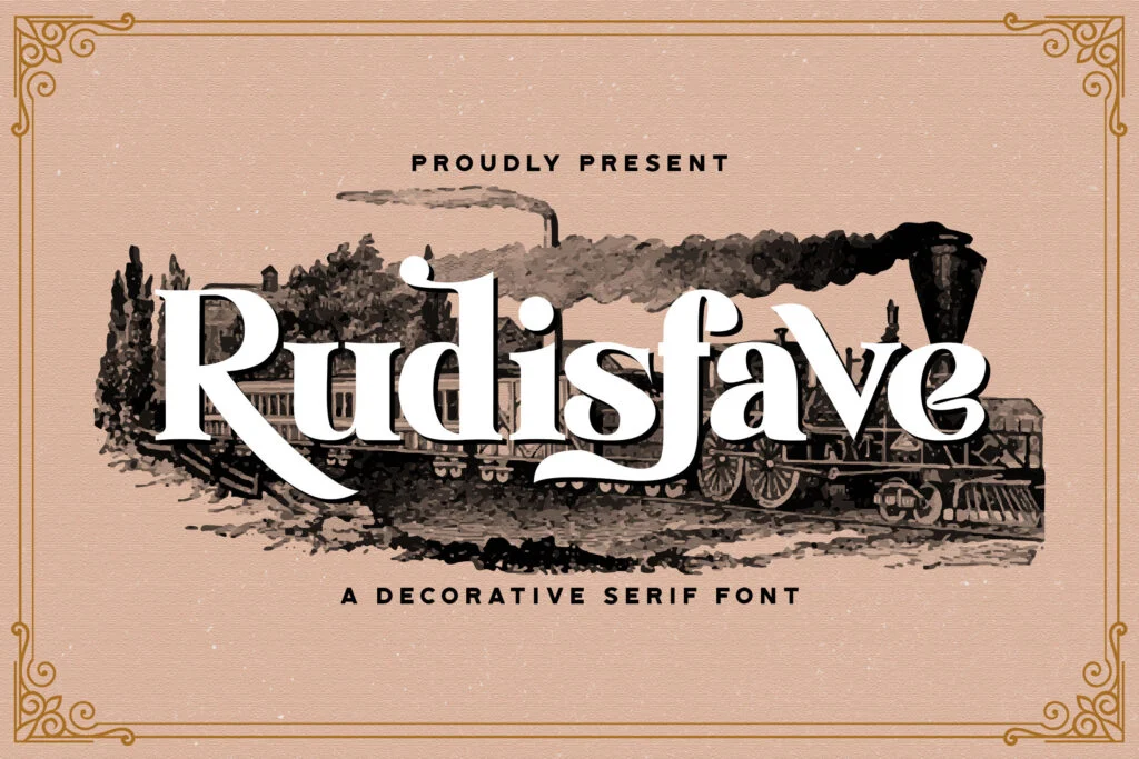


Font Details
Renjany is an elegant, high-contrast serif typeface by Stringlabs, built to look its sharpest at display sizes. In print, it holds its refined hairlines and sculpted serifs comfortably around 24–72 pt; on screens, it reads cleanest in the 28–96 px range. At smaller sizes (roughly below 14 pt / 16–18 px, depending on output quality), the thin strokes can start to soften or break up on low-resolution rendering.
-
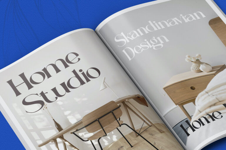
Readability: Renjany’s tall caps and modern contrast give headlines a premium, editorial feel. Counters stay fairly open for short phrases, covers, logos, and product names—especially when you give it room. For long paragraphs, the strong contrast and delicate hairlines can reduce comfort, so it’s better used for titles, pull quotes, and branding rather than dense body copy.
-
Spacing & density: The design leans generously spaced and slightly wide, creating a calm, high-end rhythm in headlines. It includes kerning (class-based “kern” feature), which helps smooth common problem pairs—useful because several characters have natural overhangs and dramatic shapes (notably forms like T / f / Q). For all-caps or short luxury-style wordmarks, a touch of added tracking often improves the silhouette (+20 to +60 in most layout apps); for smaller display text, consider light letter-spacing (+1% to +3%) to prevent dark clustering.
-
Technical strengths & limitations: Supplied as a TrueType (.ttf) with OpenType positioning for kerning (GPOS). It’s a single-style Regular (no built-in bold/italic styles), and it doesn’t include discretionary ligatures or alternates (GSUB features aren’t present), so what you see is a clean, straightforward character set. Coverage is focused on Basic Latin + Latin-1 Supplement (Western European accents), with smart quotes and a few extra symbols (e.g., €, ₤, ≤ ≥, minus). It does not target extended scripts (e.g., Cyrillic/Greek/Vietnamese), so multilingual projects may need a companion font.
For best results, set Renjany as a headline/display font: Print: 18–60 pt (and larger for logos); Digital: 24–96 px for hero titles and brand marks. Use ample line spacing for multi-line headings (start around 120–140% line-height) so the ascenders/descenders don’t feel crowded. Ideal media includes packaging, posters, magazine-style layouts, invitations, social graphics, and upscale brand identities—less ideal for small UI labels or long-form body text. License: Free Personal Use Only (commercial use requires the appropriate license).
Note from Designer:
By installing or using this font, you are agree to the Product Usage Agreement:
- This font is already FULL VERSION and ONLY for PERSONAL USE. NO COMMERCIAL USE ALLOWED!
- If you need a CUSTOM LICENSE or CORPORATE LICENSE please contact us at: [email protected]
- Any donation are very appreciated. Our Paypal account for donation :
https://paypal.me/stringlabs
Please visit our store for more amazing fonts :
https://stringlabscreative.com
Follow our instagram : @stringlabscreativestd
Thank you.
-------------------
INDONESIA:
Dengan meng-install font ini, dan membaca persyaratan ini, anda dianggap mengerti dan menyetujui semua syarat dan ketentuan penggunaan font dibawah ini:
- Font demo ini hanya dapat digunakan untuk keperluan "Personal Use"/kebutuhan pribadi, atau untuk keperluan yang sifatnya tidak "komersil", alias tidak menghasilkan profit atau keuntungan dari hasil memanfaatkan/menggunakan font kami. Baik itu untuk individu, Agensi Desain Grafis, Percetakan, Distro atau Perusahaan/Korporasi.
- Silakan gunakan lisensi komersial dengan membeli melalui link ini :
- Dengan hanya lisensi "Personal Use", DILARANG KERAS menggunakan atau memanfaatkan font ini untuk kepeluan Komersial, baik itu untuk Iklan, Promosi, TV, Film, Video, Motion Graphics, Youtube, Desain kaos distro atau untuk Kemasan Produk (baik Fisik ataupun Digital) atau Media apapun dengan tujuan menghasilkan profit/keuntungan.
- Untuk penggunaan keperluan Perusahaan/Korporasi silakan menggunakan CUSTOM LICENSE.
- Menggunakan font ini dengan lisensi "Personal Use" untuk kepentingan Komersial apapun bentuknya TANPA IZIN dari kami, akan dikenakan biaya CUSTOM LICENSE atau 100x Harga lisensi desktop.
- Saya hanya menerima "lisensi font" sebelum penggunaan
- Saya tidak menerima "lisensi font" setelah penggunaan. (Contoh kasus: anda ketahuan menggunakan font saya untuk keperluan komersil, padahal lisensinya free for personal use, kemudian setelah ketahuan menggunakan font saya, anda membeli lisensinya di link diatas. Nah untuk kejadian yg seperti ini saya tidak akan "MENERIMA LISENSINYA", karena lisensi font yang anda beli adalah "LISENSI SETELAH PENGGUNAAN")
- Lisensi font setelah penggunaan silahkan gunakan sesuai terms & condition yang berlaku setelah anda membeli lisensi font tersebut
Informasi tentang Lisensi apa yang akan anda perlukan, silahkan menghubungi kami di : [email protected]
Terima kasih.